Exploiting the visual potential of time


Evolving from the very first design (the far left), I chose the data from EEOC (government data) because I think it explained well how gender plays a role in tech fields, or in STEM industries in general. It is clear that the percentage of the male population dropped (even when we looked at the population on a global level). Yet, they still dominate in some STEM industries like technology. Interesting enough that, even though the percentage of those acquired STEM fields' degree(s)/certificate(s) declined at the same rate for both male and female. While second design (second far left) focused on race, it covered data within 2 years span. The population of those identified as White working in the tech field has decreased, but they are still leading with at least 20%. The idea was for these designs was coming from one person told me that how I can consider playing around with 3-D shapes for my visualization because it seems like it would fit well. However, the second design was coming from the idea of ripping a calendar page for the transition from one month to another.
From these designs and after two rounds of critiques from everyone, I noticed that what I want the viewers to takeaways was known more than two persons that had an impacted on the tech community. Though for the group of women during the 1940s, since it is more than one person, it was too much to do an outline without going at least mid-level details; so, I thought showing an image of their works will still give a kind of memory association when people see these next names again. Besides able to fill the sentence, "I just learned Ada was the first computer programmer" (for example), I hope this graphic will lead them to raise question(s) like if they do know not at least 1-2 persons, especially if they are in the tech field. One of the concerns that should come to their head is "how come I do not know these women figures", which would (hopefully) will guide them to look up a list of famous women figures in the tech industry for them to see how the mainstream glorified men with the tech careers, not women.
How I exploited the visual potential was I thought about the simplicity I wanted to go for. I decided to use circles and rectangles, and semi-heavy weighted lines to help guide the viewers' attention. With the use of these geometric shapes and line, I created a mimic low-details and low level of realism to provide of a chip in technology device. That way, if people feel lazy to read, they can still able to associate that these people have some impact in the tech field.
Iteration 1


For the first design (the left), the data did not fully indicate, but only address people who achieve a STEM field degree/ certificate was both U.S. citizens and non-resident aliens between 2008 to 2016. The reason I chose these data because I explained well how gender plays a role in tech fields, or in STEM industries in general. It is clear that the percentage of the male population dropped (even when we looked at the population on a global level). Yet, they still dominate in some STEM industries like technology. Interesting enough that, even though the percentage of those acquired STEM fields' degree(s)/certificate(s) declined at the same rate for both male and female. This raised a big red flag about the data. With this concern in mind, how is it possible that if the percentage of female individuals earn STEM degree(s)/ certificate(s) but in an industry like technology is still an issue.
For the second design (the right) focused on race, it shows, within two years, even if the population of those identified as White working in the tech field has decreased, but they are still leading with at least 20%. Both designs were coming from the feedback I received for either relationship or number display. One person told me how I can consider playing around with 3-D shapes for my visualization because it seems like it would fit well. However, the second design was coming from the idea of ripping a calendar page for the transition from one month to another.
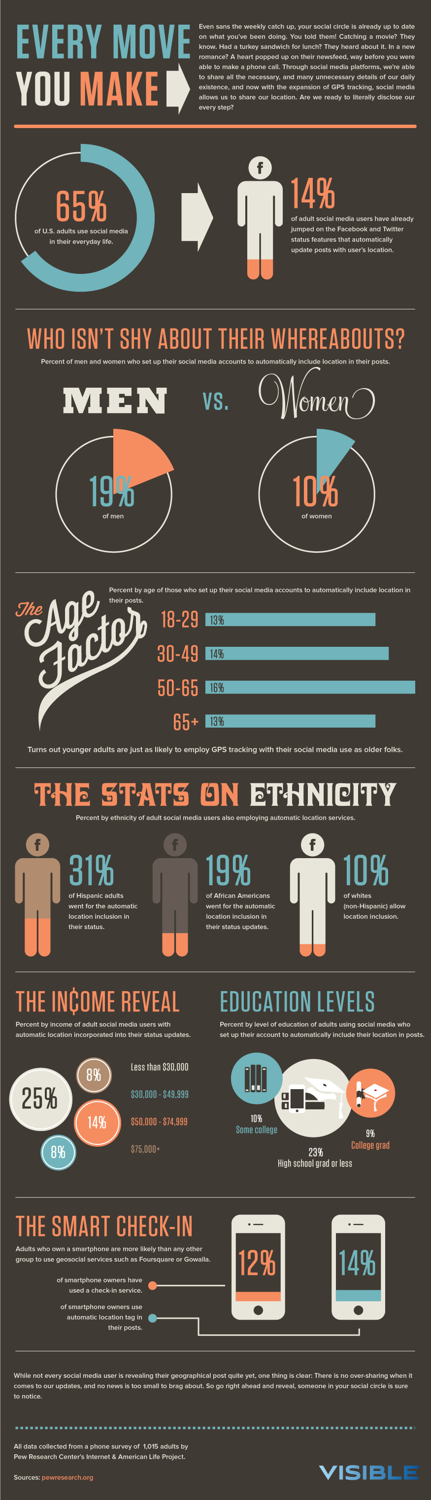
Using this design as my model for visual language (vl) and typography, I picked probably about three styles in my designs. First, the typography, the fonts that used in sections and body were well-fit with the idea of making one design look like a magazine with keeping the title one side. This requires the text width to be condensed similar to the way this model to put the "THE INCOME REVEAL" on the infographic. In terms of vl, I went the low level of realism, which is the 3D effect. The graphics were filled for most cases, except the symbol for male and female. I also used the same label styling (as demonstrated in THE SMART CHECK-IN section) to help put on the difference between 4 years, and the percentage of the race in 2014/2016/2018, in the top 23 technology companies in the U.S.

I went with the option of using different kinds of the green gradient for this display design because green represents growth. Also, parts of technology devices. However, in this case, the growth carried two things. The growing of this concern throughout time and the growing of women study technology-related majors (as well as other STEM industries). These two went in two different directions. Other than that, I used yellow and black, including other green as secondary colors because I am convinced that create a good layering style.
Critique
Shan
-
First: Like the arrangement of the title. At first, can see the shapes grow larger throughout. Secondly, can see the difference between men and women. The texts on top of the boxes (ex: ’08 – ’09) are an indication of the years. Also, see the negative values on top, assuming it indicating the values are declining. In contrast to the bottom label(s) (ex: +0.72%), it is indicating the values are increasing. Overall, it gives the message of, the percentage of women increased over time. Otherwise, the percentage of men. For both men and women, if you combined the data together, the overall percentage increased compared to other major.
-
Can see the color of the texts become darker throughout the timeline. Also, the color of the background. Perhaps, highlighting the trends over time. Additionally, the green for the boxes is different from the label identifiers green. Like how the color becomes brighter, but the darker version of this green (the background color for the last box) does not go well with the green that used for label identifiers.
-
-
Second: This graph focused on race and see the timeline goes from top to bottom and can see white occupied as the largest group member. As the members of different ethnic groups get smaller, the size of the text goes smaller as well. It is a good way to save space in this graph. Not exactly sure what the lines represented and if it does matter, consider modifying the way it arranged? The use of teal green, back is lighter, while the font is darker, it provided the more 3D feeling.
-
This design conveys the message very clear.
-
Indication for 2014 and 2016, why “undeclared” value did not include because it might confuse viewers since 2018 included the “undeclared” value.
-
-
The content for time display should match with relationship display to provide a more cohesive storyline. Despite the content parts, like the second one more because in the first design, the use of green color is a bit distracting. At the same time, the first design is a bit crowded with the information as well, especially with the colors. One way to reduce the information in the first design is used the “—” or “+” to indicate which way is the trend heading toward.
-
Visual language: The format of the designs is different, but there are still resemblances. For example, the use of shapes, and label identifiers in the “SMART CHECK IN” are similar. The model also used solid colors and solid lines shared the same style in the designs.
-
Color model: Consider using a darker green color for the first design if you decided to use it, in order to match more with the model.
Respond to Shan Feedback
My first reaction to Shan's comment is the color model about the green color. Originally, the green I used for both designs were the same as the design on the right (the second). However, I decided to change the level of HUE a little because of the fact of seeing the same colors over time, again and again, sometimes, I get a boring feeling. After changing the color in the first model, which was originally a 2D style design, the 3D effect idea sparked in my head as I thought about how living thing has multiple dimensions. Hence, the idea of turning both designs into a 3D style work. Second, I intentionally follow the use of leading lines on both designs to indicate the change and what are the trends of the data over time, to reduce the number of works they have to do to figure out the directions of the data, as I also thought about those who are not familiar with this topic. However, I did not realize it can give viewers a sense of clustered/crowded as Shan described.
While Shan's suggestion of keeping my time display content align with my relationship display to provide a more cohesive storyline, I will have to reject this suggestion. One of the reasons is my topic is way too abstract, and based on the information I found so far, it is harder to align my content for time display to match with the relationship display. However, I believe that whether my time- and relationship display shared the same context, based on the information I have, I am confident I can provide a cohesive argument, "why people should pay attention to the diversity in tech issue(s)". With that being said, I did not take on her suggestion of only using "-"/ "+" symbol either, as well as the suggestion on improving the first design - the use of color, labeling. I redo my design for Iteration 2 based on the first one (the left design) as I think the context will make sense using the time display concept and give me more flexibility when I put all the designs together. Additionally, I think I get a better sense of how time display should be organized for my final work.
Responding to her comment, what the lines represented in the right design, it was represented X% out of 100%. My lack of attention to details of forgetting to provide more context seems to not only confused her, but also others who looked at my design. Her comments on indicating why certain variables in the graphs do not exist on the info visualization was a good reminder to myself that I need to be careful with how I include and leave out information.
JoJo suggestion
-
For the timeline, it is best to talk about the key events – google the key events, examples, governments encouraging the cooperation’s hiring a diverse body of people.
-
Be careful with the first design because it seems like the number needs to get bigger and biggest as well.
-
Also, be careful when designing the timeline because there is no zigzag and stick with the standard time line.
-
Used a really old iPhone to indicate like 2008, then iPhone 10 for 2019.
-
For the final version, the number and the timeline can go together. However, after all the works if time display is not necessary, then a line chart is another good way to include in the final poster.
-
Another way to organize for the final layout: diversity in the tech industry, gender and race, then tight in the end, this issue is two folds.
Kimberly
-
First:
-
See the percentage of individuals acquire STEM as a bold title and center-aligned. The title is all caps, there is also the use of upper and lower cases throughout the graph. The graphic reminds the flashlight and sees the gradient of color – as the timelines go on, it becomes darker. It reminds the staircase style. When see the label of ’08 – ’09, the percentage of male and female earn STEM degrees. There is an increasing for female in earning a STEM certificate/degree. Different for males. The same patterns repeat throughout the design for both female and male. Also, the graphics thicker, larger and the texts getting bigger. Additionally, there are the use of label identifiers and the use of color to indicate the change of percentage in female and male. Seen an overall increasing trend for female and decrease for male. The use of white lines provides the 3D effects. Everything is horizontally organized, also simple and clear.
-
-
Second:
-
Look like the bamboo shape with 3D effects. See the race division in tech companies through the use of a percentage. Started at 2018 because it is the linear part of the graphic design and seems like you would prefer people to start with 2014. The information about white individual label has the largest font in comparison with the other has a long leading line. The percentage goes down as the fonts go down. The last lines seem to be longer because of the value. Same orders and styles used for all the years (2014, 216). The data that shared the same value have the same length, except some. The text color is dark gray, which also seems to share the same color as the title. The graphic looks little bends and used a mixture of teal greenish. Same color use of text as the background.
-
-
Preference: like both because of the 3D effects and the font sizes, but don’t have an exact preference. However, confused how do you want people to interpret the graphics because of the way its layout. The first graph is more meaningful because readability is easy to make sense.
-
Color model: the use of green in both designs emulated well from the model, including the off-white color from the background. The use of gray text and the white on green color are the same.
-
Visual language: follow the same used of leader lines. The model is flatter. However, the designs are more 3D, that’s one of the differences. Also, the model does use any angular alignment, but linear in the VL and work from the left to right, and somewhat realist because of the use of symbols. These are some of the visual elements in the VL, however, it is not seen in the designs. Additionally, the use of labels is on the right side (for the graphs) in the VL, in the design (like the second one), it organized on the left.
Respond to Kimberly Feedback
When Kimberly gave me feedback, I noticed she was able to pick up all the information I included in the designs. For example, the graphic becomes thicker and larger as time goes on and the trends of the data. Though I did not realize the second design gave a bamboo kind of image when I put the work together. I agree with her that the way of the second graph does not fully make sense because the way this graph organized was top to bottom and left to right, which is somewhat unusual, since the kind of time people are used to is reading from left (start with the lowest value) to right (end with the most recent value). With this comment in mind along with other's feedback, I decided to stay simple for version 2. Moreover, I respond to her comments about including the use of symbols (low level of realism) and the label identifiers, not following the visual language model was not my intention because I wanted to express my design more freely a little.
Khoi
-
First: See the title very clearly with the below texts indicates the population. The title is in gray and see the steps timeline that is kind of stagger out, and see the bigger box first. Then goes backward from the right to left, and see the male and female. Afterward, notice the time (in years). Also, see the negative of percentage changes. However, it took a while to figure out that is the trends changes in the years and the leading lines of indication what it meant. Coloring is consistent and progressed from light to darkest.
-
Second: See the title is about the average. For this, can see the ribbon and band kind of affects, and started to read from bottom to top. Started at the bottom and see the three main years, 2014, 2016, 2018 and the yellow leading lines that indicated the value. White organize as first, then the other race because of the lower value. The only text color different is the one inside the shapes. Statistical data is organized from a top to bottom style. Pretty easy to follow.
-
Prefer: the first one because it is clear that the orientation is left to right, but the second design is not as clear. Also, like the use of change in color and seems there are too much information on the first design but not enough color contrast. Consider play around with the colors more, and include some color contrast. At the same time, the information is kind of blend in. You would want to bring out the focal points of your information through the use of colors and make it more prominent. In general, focus on improving the contrast. Consider removing the percentage change indication because people can still identify the change/trends, since the numbers organized next to each other. Especially, the overload information makes the design overcrowd.
-
For the first version, the green is way too light but the green on the color guide is kind of teal, while the second version follow the color model better. For the visual language, the fonts are consistent with the VL. The different use of color for men and women can applicable to the first design. Also, there are a lot of contrast aspects are being used but there are not a lot of contrast going in the designs.
Respond to Khoi Feedback
Reading Khoi comments again with other people feedback in mind, I noticed one of the biggest concerns with my time display work is the readability. There seems to be confusion of where, and when to start, while I wanted the viewers to start with the title first, then go from left to right, for the first design. For the second piece of work, I wanted people to start from top to bottom. Second, it is the use of label identifiers/ leading lines, to some people, they are not exactly sure why it was included; and for some people, it created confusion. With this consideration mind, I was much more careful with the use of label identifiers/ leading lines for the design in Iteration 2. Like many others, the second design was confusing for Khoi and I can see why through his explanation, which also similar with previous commenters.
Same respond to Shan about the use of green for my first design, I wanted to try something different for my work, but since we have to follow our color guide, I thought to pick another green would be fun and see how it will work out. However, after close evaluation, I noticed using the original green make does seem to make the graphic look more comfortable. Regarding his comment on the first design, since I reworked everything, I did not include all the feedbacks in my design, except be careful with the use of colors and think about my focal points while working on Iteration 2. His comments on the use of my colors was one of the many reasons I pay closer attention to, how I want to use the colors for the Iteration 2 work that will provide a more appealing, contrast but not too distracting.
In response to JoJo suggestion, I did look up key events that focus on diversity in tech. With the given time, I could not find anything but important women figures that have made contributions to the tech world. I decided to use this information because of the fact of not a lot of people know most of them provided a stronger case, why we should care about diversity in tech. With that being said, I did not fully pay attention to the second and third suggestion much, but be careful with keeping my design linear. Additionally, I am working on cooperating the idea of using the iPhone evolution to indicate time change because I really like that idea. However, at the moment, I have not figured out how with the given information I have. Furthermore, I purposely bold certain parts of the last two suggestions because I think that is a good comment for the next couple assignments on how I design the other displays that I can put all my information in use without being stressed later on.
Iteration 2


There is a subtle message come within this design. I wanted viewers to look at this timeline and see how many people from this timeline do they know. One reason is when you look up famous tech people, or something along the line, it is hard to find information or see that those famous tech people are identified as female or others, but male individuals like Bill Gates, or Mark Zuckerberg. The subtle message in this work is, going back as early as Mid 19th Century, there is a woman involved with the development/ evolution of technology. Yet, we do not seem to pay our mind much to it and convince that this is a male-dominated industry, and that's because of the social construction of gender norms. This should also lead people to wonder, are there any other women throughout history have important contributions to the tech world that is not on this graph, especially people of color? If viewers find themselves questioning the history as I do, then it has more reasons why we should pay attention to diversity in tech. Not only to provide equal workspace and opportunities for everyone, but making sure that people (women) receive the recognition they deserved.
Since I am going for a simple design, I use the fill shapes style like fill square(s) and circle(s) with a semi-thick weight line to guide the viewer's attention. Technically, the model did not use any square for the graphical representation, I used the square shape because I think it gave the technology vibes when using it. Also, I combined the way this model and the color guide of doing the title, as I think it provides more contrast. Furthermore, the use of lines was to split information and capture information in a space that does not give the clustered feeling.

I used the color of teal greenish to represent the main timelines because it shows the progress over time as green represent for growth. This was a subtle way to express my thought of like, "look as time progress, there are only these many women are documented in the tech industry history. How many women on this timeline do we know". The use of yellow was an indication these figures play an important role, as the yellow/ gold color represents valuable stuff (like gold). The use of gray for the graphics around the title was a mimic of the connector on the motherboard, something we do not use but it has a great value to the technology device(s) we use in our daily life like a smartphone, laptop, etc.
Critique
Khoi
The first thing noticed was the title in two different colors. Also noticed the graphics on the both with leading lines that lead to 1940s. The lower description underneath the year with lighter black. Then move from left to right, then went from top to bottom. See two kinds of leading lines, one with greenish colors (8 of them), and the other one is yellow that is coming out from the green dot that contains information about women in tech. Each description box contains a picture that gives an assumption that it is about the person/programmer.
Prefer this format compared the other two because it is simple with the left to right, and top to bottom orientation. The incorporation of pictures is very helpful. Overall, the pictures and the design go well together, but it looks sort of busy. Consider reducing the words/ descriptions and keep them to the minimum. Also, was not sure about the title, but considering keep in one color if interested or make it a perfect box rather than a triangular shape.
Don’t really use photos in both models. It is up to your decision how you want to modify or turning it into a similar style with the visual language. More color green than yellow, but it's good. Consider playing around with the colors more because, in both models, they play different colors for description. At the same time, it provides more contrast. Personally think that the main focus of your design (the best) is to reduce/ keep the amount of information to the minimum.
Response to Khoi Feedback
Khoi Feedback seems to be quite positive in terms of how the timeline is organized. However, I did not really reduce the words/ descriptions because I have trimmed down quite numbers of information, if I cut down more texts, there will not be much information about what these women did. Though I did take advantage of the white space idea to see if I can make it look less busy because I do agree with him that the design does look somewhat occupy. Additionally, I did not go with his suggestion of keeping the title in one color and text box style in perfect box shape because 1) the way I did the title color is following the visual language and color guide, 2) its kind of hard to go for a perfect text box (rectangular) as it does not make sense or looks right to me personally.
Some of the suggestions I did take in and incorporate is the use of colors, not necessarily included more colors. All I did was making the graphics I already used more obvious because I could figure out how else I can incorporate more color in terms of graphics use. I did also changed the text of the year(s) to be slightly more bright yellow (look like orange) to indicate that I am highlighting these years.
Hedy
The first thing noticed the mainline is horizontal and a lot of blocks and paragraphs located around the mainline. Also, immediately to tell that the orientation is from left to right, as the year was the main focus. Then noticed the title of the timelines. The title gives the idea that these are the women programmers and the orientation are from past to present. Additionally, noticed the two graphics next to the title but not sure what it meant.
The font for the year is bold, and feel like purposely make the years eye-catchy. Then see the women’s names, assuming that’s the programmer’s names based on the given information from the title. There is also a bunch of paragraphs of what these women do. There are a lot of images. However, it has a different style (some are a cartoon, realistic). For some, there are no specific, and for some, the representative picture was used to showcase what they did. Considering be consistent with the use of pictures if possible. The time is not connected together. Some of them are separated. The green color is used for the main time. The yellow lines are the guide to each block. Definitely, like the design because it provides a sense of contrast.
If your infographic is not a big one, the words are a little too small. Consider making the years and names bigger, reduce the contents a bit. Think about the pictures used on the timelines because when you put together all the information, it might be too distracting and give a sense of clustered.
Prefer the first one because the second design (the old one) takes sometimes on how to interpret it, even though there is alternative information displayed to help understand the graphs.
Visual language - there is no realistic photo. So, think about if you want to put colors or realistic color in the display. The use of icons and images are rather simple, which is not similar to you. Perhaps, explain your choice of icons and images. In terms of title, the title style is matched with the visual language. Considering, putting the “timeline” a different color and put it on a different line, while everything else shared a similar color because it will put more emphasis on the tile. The fonts match with the one on the visual language. Remove the bullet points in the content boxes because it was not used in the visual language, also its one way to keep the information to the minimal. The design is a little depart from the visual language because it does not use a lot of square shape like yours.
Color guide – See the use of green and yellow color from the design. For your design, you can make some stuff bigger to put more emphasis – like enlarging the timeline. Follow well from the color model. However, there are a lot of icons inside the color model, and for the design, does not see a lot of use of color in a section and make the line weight heavier.
Response to Hedy Feedback
One of Hedy suggestions was ensuring the graphic I used for each woman is consistent because 1) my visual language model does not have a realistic graphic or color, 2) play with the color choices for the time and put more emphasis on the title, 3) remove the bullet points to give the text boxes more space. I actually tried with keeping all the graphics to low-level details, everything looks united to me. Though I could not do low-level detail for the 1940s' women. One reason is there are at least four of them, doing a bunch of low-details figures of these individuals will make the picture looks blur since I have to fit quite a lot information in such a small space. With this in mind, I looked up a sample drawing of their works and used that instead.
Second, playing with the color choices for the timeline led me to this final revision, the use of teal green and light greenish was pretty interesting and seems appealing because it put more contrast on the highlight and also seem to associate the even years with lighter green, while the odd years with dark green. Another thing was the change of text color for the years, I made it look more appealing to ensure it will gather viewers attention like Hedy was explaining to me, how using a different color for the year could be one way add more color to my design. She did say somewhat the same thing as Khoi previously how a perfect text box might seem to work best for my design. I reject this suggestion because I am not convinced and had a play around that it would not make sense. She also gave me a suggestion on how to put more emphasis on the title by perhaps, keep the "this timeline" different color compared to the rest as another subtle hint that this was something happened in the past that probably not many of us pay close attention to.
Third, I removed the bullet points and it does look more free up as she imagined. Additionally, I do not think I have to follow the visual language model all the way because yes, my visual language does not use a lot rectangle or square alike shapes, but they give a better sense of techy in comparison with circular. This is a reason why I did not use many circular shapes.
Lastly, her suggestion of making some of the stuff in my design bigger and I did because I can see why she was saying that when I looked at my design from afar without zoom in. It also improves readability and salience. Making line weight thicker was also the right decision because it seems to do things I did not imagine like provide a better sense of boundary between contents when I increased the thickness of the yellow lines.
Maxine
Eyes are immediately drawn to the title because of the font size. Also, having the first line in a different color with the rest was eye-catchy. Then noticed the timelines orientation from left to right as time progressed. Also noticed there are bold text and lighter text. There is also visual incorporation. Lines have different colors – the green lines represent the progression of years, and assuming the yellow leading lines were a way to viewers’ attention to the information of that year.
One thing is the way order the different period. Since the beginning, in the early period, should be on top like start with Mid 19th Century because attentions were drawn from top to bottom that way viewers will not miss out important information. The gold lines stop right at each woman and sometimes wrap around, while at the bottom, it stops right at the bottom of the pictures. Consider staying consistent with the way how you are wrapping the texts.
Visual language – see that you made use of the leading lines and that seem to share the same thickness as the visual language. These leading lines seem to stand out in the visual language when it uses, and the same thing happens in the design when using these lines. There are no pictures on the visual languages, but consider using drawing graphics to be consistent. Information for the visual language organized in a box style and the same thing was done in your design. The way the text organizing in the design is similar to the visual language. The headline in the visual language seems to be bigger than the one in the design, consider making it bigger to draw more emphasis.
Color mode – see the green and gold, off-white background, including black texts that are included in your design. The color that was used in the design emulated well from the color guide.
Response to Maxine Feedback
One of the feedback I received from Maxine was similar to others was the use of the image. Again, the use of images is necessary as it will provide the viewers with something to associate with. So the next time when someone mentioned one of these women names, they will remember, which was the exactly I used images for this design. Her suggestion of making the headline bigger, which I did. I enlarged the "THIS TIMELINE" compared the rest because I did like Hedy idea and it seems to work out well. Other than that, she did not have any specific comments about my design as she thought it was emulated well from the color guide, but be careful with how I following my visual language. With that being said, my visual language did not use quite a lot graphics and I put some twisted and turned on my design because I think it provides a techy feeling, and I personally think it fits well. However, I still evaluated every person feedback very closely whether I would modify certain things.
Final Revision

From this design, I want viewers able to know more than two persons that have made contributions to the tech revolution. However, for the group of women during 1940's, due to the fact it is a group of women, it was much more harder to do an outline without going at least mid-level details; so, I thought showing an image of their works will still give a kind of memory association when people see these next names again. Besides able to fill the sentence, "I just learned Ada was the first computer programmer" (for example), this should lead also lead them to raise questions if they do know not at least 1-2 persons, especially if they are in the tech field. One of the concerns that should come to their head is how come I do not know about some of these people? it seems like women are being underrepresented in the tech industry, etc...
How I exploited the visual potential was I thought about the simplicity I wanted to go for. So, I decided to used circles and rectangles, and semi-heavy weighted lines to help guide viewers attentions. With the use of these geometric shapes and line, I created a mimic low-details and low level of realism to provide of a chip in technology device. That way, if people feel lazy to read, they can still able to associate that these people have some impact in the tech field.
The use of shapes and lines I borrowed from my visual language model are filled shapes - circular, regular or square alike shape, and the leading lines. As I explained previously, I did not use a lot of circular shapes like the visual language does because I do not think the use of circular shapes will give the techy feeling to viewers that this is a tech-related topic. However, I still incorporate some circular shapes to provide a gap in the timeline that way I can incorporate the repetitive and unity concepts in this design. Additionally, provide a sense of contrast. Then the use of leading lines, it is extremely useful to guide the viewers' attention properly. Something I did not follow exactly is the use of icon like the human icon because in this case, the use of icon like a human is not useful since it does not represent for the contents I had. Hence, I decided to go with the low details of some women figures.

My idea of using a lighter green in part of the timeline was coming from here, the lighter green with water drops that contain numbers to guide viewers attention. The only difference from my design was it used to provide more contrast. Also, I chose green for the timeline as it represents for the value of growth, while yellow/orange-yellow for the leading lines and years is the indicated this is important and valuable to the topic. Also, the use of gray can be spotted in some of the texts. For example, the phrase "this timeline" is dark gray because 1)better readability for some people, 2) gray often associated with the idea of something is forgotten or the gray area that we do not use. The gray here represent for something in the past that we (might) have forgotten.