Exploiting the visual potential of relationships


After the viewers look at the relationship display, they should be able to say that the gender norms might have contributed to the low rate of women in the tech fields. For example, gender norms about men being more intelligent than women feed into their behavior or believe there is a need to prove themselves competent. Although the collected information did not directly support this topic, there are still chances that these are/were what happened to women in tech companies.
The two bottom designs on the left, the ideas came up after I looked at the Sankey Diagram example that was shown by Marilyn. While the one on the far left (with green and yellow) is more of distribution, the one on the right (all yellow), the left side is the reasons that affected women decision(s), whether they will commit to a tech company, which also explain why the right side is a list of the companies with the percentage of women. It is also an example of how those reasons feed into a human, hence the resulting of the concept. The top two designs (the green and mixed of purples), I am not exactly sure what I was doing with the layout. The idea for the green design was to show gender disproportion at these well-known tech companies. While the purple design was meant to express something, for example, the percentage of Asian work in the 23 companies (e.g. Apple, Facebook, Dell) is let say that is 23%. That overlap is an example of how much the 23% means to the let's say that is 50% of White working in these companies. This way viewers will have a relative idea of how small/ big these populations are in the tech field. The last designs on the right (the one that used a lot of circles) idea came from after I did the second critique in class with others. I saw someone did like a tree branch relationship and thought I should give that a try to my designs. The first one (with three subsections contained the bubble with statistics), at first I want to go with square, but when I started to play around the shape and the statistics on the layout, it looks awkward. Then I stared at my visual language for quite sometimes and saw the use of circles. So, I tried that. Turn out it was a pleasing layout to my eyes and makes the most sense to me, and many others as well. With this focus point, which design makes the most sense to those who are not familiar with the topic, not just me, I decided to choose that to rework for my final revision. My final work (the one far out on the right), it becomes a compressed version of the one next to it on the left. However, it is a cleaner version with more white space to prevent the cluster feeling. My decision on putting them together because 1) it reduces quite a number of texts, 2) it also makes the display look less occupy. This is how I exploited the visual potential relationships for my topic.
Iteration 1


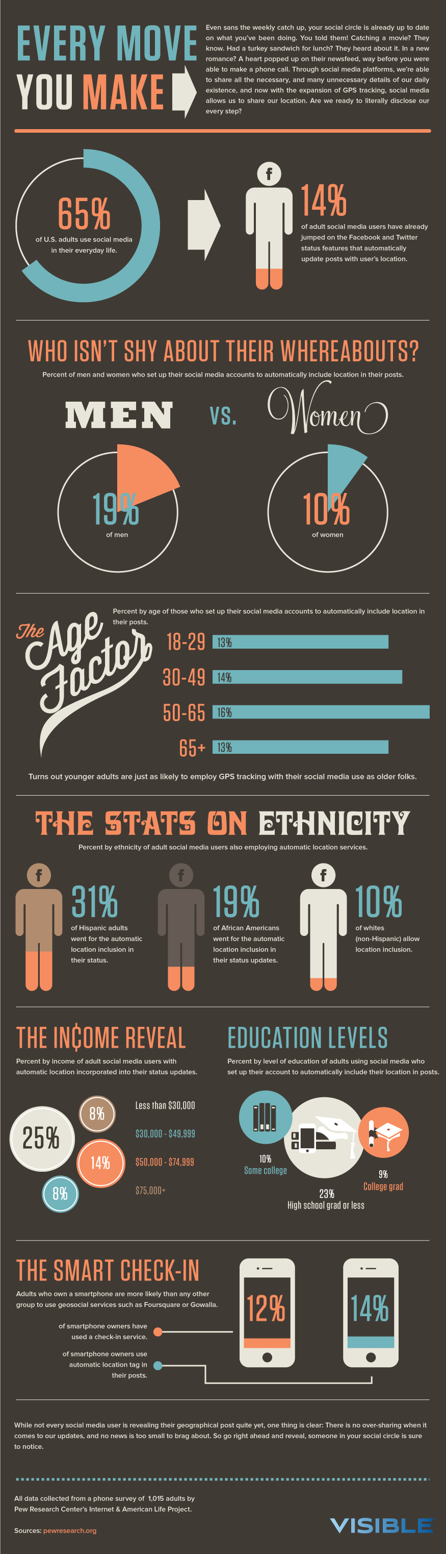
For the first design (on the left), I think it reflected well on the relationship between male and female working in the major social media companies. The intention is to give a general image of the percentage of female made up in these companies. While in the second design (on the right), the overlap represents how much those races made up in tech companies (e.g. Facebook, Dell, YouTube). For example, when looking at the percentage of Black in tech companies, in relation to other (White, Asian, Latino), it is a clear image that there is still a representation issue in this field.
For both designs, I went with the visual language model like fills shapes, and similar body font with this model. Furthermore, this model led me to come up with these designs because of the simplicity in this guide. For example, the design of smartphone at the lower session.

For the first design (on the left), I decided to go with the colors for this model because I think it will allow the texts to stand out more. This way, it provides a clearer image of "what is the genders proportion (male and female) in some of the well-known tech companies(e.g. Facebook, Instagram)?", due to the text use style in guide as well. Although I do not have a clear explanation of why I went with different colors for the second design (on the right).
Critique
Marilyn
You’ve created two visually intriguing displays… but they don’t qualify as relationship displays. The first one looks like a relationship display - it looks like a Sankey diagram. But a Sankey diagram shows flow from source to destination and that's not what's happening in yours (the men on the left design is not transforming into the women on the right). It’s occurring to me that you COULD do a Sankey diagram by starting on the left with just two bars that represent men and women who work at all of these companies, and then showing the companies themselves on the right with the lines splitting and going to their respective companies (similar to what you see here: https://i.stack.imgur.com/lJO9o.png).
The second one looks like a relationship display too (a Venn diagram), but what does it mean to be in the overlap of “Black” and “Asian” - it seems like that should be people whose ancestry includes both people who are white and people who are Asian, but I don’t get the impression that that’s what you’re doing.
Another idea: If you have the data, it could be cool to show a Sankey diagram with the percentages of people of different ethnicities on the left versus the percentage in tech versus non-tech.
Respond to Marilyn Feedback
Taking on Marilyn feedback and after discussing it briefly before class on Wednesday, I got a better idea of how a relationship display should look like. With the feedbacks, I decided to try three different designs as and decided to try one with a Sankey diagram using an example that was provided by Marilyn. In response to the question, what does it mean to be in the overlap of "Black" and "Asian"? My intention of using the overlap was to show how it actually looks like. For example, the small overlap of "Black" and "Asian" mean, if the square represents for the percentage of Asian in the tech industry, this is the Black percentage will look like in proportion to the Asian population in this field.
Vincent G.
So most generally, prefer iteration 1 in terms of displaying information, emerging relationships. I would say my immediate response is that we still see male-dominated tech industries. Have some questions about the race box on the right, what, specifically, are you trying to convey? Which part of the infographic display white being the majority? If all of the boxes are ~ the same size (more or less), how does one interpret white racial dominance from that chart specifically? Consider using boxes that are commensurate with racial representation! So if you wanted to do something along the lines of a big square being used for "white" and then a smaller square being used for "Asian". For example, if White represents 50% of the workforce, and Asian represents 25% of the workforce, you could make the Asian box half the size, to keep the box size consistent with its representation! On another note, part of me thinks if there is no specific reason for choosing different colors maybe not mention it
Respond to Vincent Feedback
In responding to Vincent question about the what was the purpose of the race boxes in the right design for? Same thing I mentioned in response to Marilyn Feedback. Those boxes were meant to provide a visual image what does X percentage of Asian (for example) and X percentage of Black looks like, in relation to X percentage of White individuals in the technology field. Since he is the second person that was confused, I am currently considering how to convey the information better through reflecting on his suggestion and the one that was provided by Marilyn. However, the three designs in Iteration 2 were definitely a combination of suggestions from Vincent and Marilyn, included Bryan.
Bryan D.
The first chart (on the left) doesn't make intuitive sense to me. When mapping flows, it wasn't clear to me at first that the left side was equally corresponded to the right side to add up to 100%. If you want to improve on this graphic, you can add different gradients of green to help direct flow. This data could be also better visualized in so many other ways (one way is a series of different pie charts). And more broadly speaking, the male/female binary you have laid out here might be offensive/ exclusionary for those who identify with a different/ nonbinary sex. The chart on race is missing percentage data on the overlapping area(s). Are these areas to scale? Where are you getting these racial categories (i.e., the US Census)? You may want to source that!
Respond to Bryan Feedback
Taking Bryan Feedback into account, I do agree that the first chart does not make intuitive sense after looking at carefully. I incorporated Bryan suggestion on using a series of different piece chart in one of the designs in Iteration 2 (all though I am not actually creating a series of pie chart the design was inspired by this idea). Also, one thing he mentioned that I noticed I let it slip out of my head was the use of gender(s)/sex in design. He did have a point (although I did not include this, specifically in Iteration 2) but I will definitely have some sort of footnote or indication that where these data were coming from and some clarification about gender(s)/ sex inclusivity - why I only used "men" and "women", as a clear acknowledgment I have for others who do not identify themselves as "men" or "women".
Iteration 2

In Iteration 2, I did more than just one design because I am still feeling a little confused about how a relationship display looks like. With the first (top) design, I intended to provide a visual image for viewers to see that in most of the major social media site companies, the percentage of workers that identified as male is higher. While the two designs at the bottom intended to explain the potential factors that lead to the lower percentage of women in the tech field. One important note is I have not able to discover any data about other individuals who do not identify as "male" or "female". I believe there is some data about it, but as I continued to develop my infographic, this is something I will keep in mind, why is it difficult to find data about other people who do not identify as "men" or "woman" that work in the tech industries.


Using my visual and typography model, the designs in Iteration 2 shared the font with this model, whether they serve as labels, or captions, or titles. My decision of choosing this font was the style is not too wide that you can put in a small space, and the level of readability is still there. Another thing I followed the model was the used of fill shapes with no outlines for the top and last designs. The use of fill shapes and outlines, including the layout of the information for "THE INCOME REVEAL" and "EDUCATION LEVELS" was the two that sparked my idea for the second design (the one on the left). I borrowed the idea of using the somewhat thin weighted line to introduce the possible three factors that contributed to how gender plays a role, why the percentage of women working in the tech industry is low (including women of minorities).

I personally like the color model a lot because the contrast that created when you put the yellowish nor greenish, whether together or with gray (dark to semi-light), I think it gave a pleasing feeling. At the same time, one of the hidden messages through this design, using the model was they used the yellow to high those who were affected by this problem. Using similar methods, I applied this strategy to the top and last design in Iteration 2.
Critique
Shan
-
First: See that this is a distribution of how people used different social media and then it is shown in percentage. Can see that women are different from men. It is a good use of color, so I can see the distinction between two different groups. Because of the nature of the graph, can see that there are overlaps between color and a bit confused because certain parts of the design have gaps. Also, the use of white color for the texts is consistent.
-
Second: This one has a lot more texts and can see there is the lines connect with different parts of the graph. Each of the groups show different aspects. The first one shown different factors and see larger number indicate percentage, and there are short texts explained what is shown in the graph.
-
The second element: see there are different populations; the third element: see there are different populations on the graphs, similar layout. However, different in contexts.
-
See the similar pattern in the first and last elements. However, it is different for the second element. Moreover, not exactly sure what is the purpose of the design for the second element.
-
-
Third: Like the oval shapes of this design, and see the distribution of different social media is similar to the first design.
-
Can see the left part is the perceived bias and definitely there is a combination pattern of the first and second graphs. Also, saw the overall title “PERCEIVED BIAS” and wonder, if the left side of the graph is the bias, and the right side of the graph is where those biases distributed, because it is not fully clear.
-
The right part used different format for the graphic, it has the circle boundary, while the left side does not.
-
-
Visual Language: Based on the model, there are a lot of circles and combinations of squares. Can see the first version has both the circles and squares/rectangle.
-
The second design is kind of different with the first and last versions because it used more lines and circles, in compared with the other two, the kind of style it used is more like a root. The second design is closer the visual language model but, in the model, there are not a lot of texts. Consider rephrasing the texts in the designs, reduce the texts and put more emphasis on the numbers – to draw people attention.
-
In the model, there is a comparison data through the use of data, perhaps, explore how to make the relationship display somewhat similar to the way the visual language goes.
-
-
Prefer: the second design because there is more information that allow viewers to make sense intuitively easier but definitely, consider the amount of texts, and make the numbers bigger. In terms of the layout, there are kind of two columns. In your case, it seems like a combine space, consider how you would like to incorporate your second design if that’s the one you want to include. Perhaps, separate them is another idea to explore because the elements in the second design has different relationships.
-
Color Model: the color uses match the model pretty well.
Respond to Shan Feedback
In summary of my response to all three of her comments, I do realize how she was struggling with interpreting the information a little bit since she was taking more than 5 seconds to explain what she saw, including discussing her confusion. To be quite honest, I was not exactly sure what I was doing with the first and last designs, but experimenting the color and organizing information, which is why I do not have an exact answer or clear explanation. Especially, I was trying to figure out how will relationship display work for my topic. Regarding her confusion on the second designs, I noticed that the overwhelming amount of texts was one of the many reasons is why she was confused about the purpose of the design. The purpose of the second design was to showcase that, these are the problems that women and women of color report how they feel about working in STEM fields, which can be a potential explanation for the low rate of women in the tech industry or working in the tech field like software engineering.
Since the final iteration is a rework of the second design, as much as I like the idea of keeping the number of texts to the minimum, I rejected this suggestion she gave. As I mentioned in the previous section the purpose of the second design, the number of texts is necessary to explain the context, especially when the data did not gather to support this topic and I did my best to keep it to the minimum. However, I did take on her suggestion of making the numbers bigger to align with my visual language model more. Her comments on how the information in my visual language was organized in two columns format sparked my idea of aligning my final iteration on one side that will provide a sense of this information is wrap in a box.
JoJo
I think you might have gone about it a bit backward. Let's say you wanted to showcase the issues underlying why there is a lack of diversity within the tech industry. You would compile up those reasons and those become your nodes, and if there were nodes that lead to another cascading reason, then you could link them together! Overall, all of those reasons point to the overall issue: lack of diversity in tech. That's just one way to go about it!
I see you're showing the differences between gender and race makeup of specific companies, but that might be better to showcase with your numbers display! You could do it in a relationship display, yes, but you need to identify what is the relationship, what is the nodes and links you want to show in order to get your message across.
It seems like you're trying to cram everything into one, both what are the reasons behind this lack of diversity and also what is the actual split of workers in those fields, but I think your overcomplicating your designs by doing that, it gets hard to follow and it's hard to see what exactly is the focus of this. I would recommend focussing on the reasons! That way, all the facts you show after just emphasize how bad this issue is!
Respond to JoJo Feedback
I do agree with JoJo's comment on how I might have over complicated this and trying to cram everything into one, which was why when I asked some other people, they were confused and feel cluster when looking at it. However, the comment of "what is the nodes and links you want to show in order to get your message across" reminded me of the focal point of my topic. So, I decided to rework the second design in iteration 2 as my final iteration because I think it is the one that makes the most sense, but still good enough to support my topic as well.
Marilyn
What I see:
- I see men and women and then arms reaching out to different companies. I see that the women section at Google and YouTube and Facebook and Instagram is smaller than the others that look closer to 1/2. I assume this is referring to the staffing ratios.
- I see “Gender” in the middle with branches to three displays. Above leading to gender I see “What are the potential contributions…. Then I read “The Perceived Bias” and it talks about 3 factors that explain low rate of women in the field. Then “As Competent as Others” which refers to black women needing to show more evidence of competence than others”. I see bubbles below and associate the 77% black with the statement I just red. Then I assume that 65% of Latina women feel that way, 64% of Asian women and 63% of white women. Then “Stereotype: The Feminine Role” talking about how 41% of asian women feel pressured to be stereotypically feminine and the image below shows white, Latina and black women feel this way less.
- In the final display I see women in the middle and 3 branches to women and 6 branches from women. The 3 on the left seem to be percentage of women who experience these gender bias problems, to the right I assume is the percentage of women at these companies.
Which I like:
- I like the simplicity of the first one, but find the message doesn’t jump out at me the way I wish it would.
- I like the second one because it has so much information and makes it pretty clear.
The third one is straightforward but I’m having trouble making sense of what the lines mean and find that a little distracting.
How they follow the models:
- Visual Language: The use of circles follows the VL model. It doesn’t seem right to have them outlined. --The colored circles in the VL model have a line that is slightly inside the outer edge of the circle
- Thick bars fee consistent with the VL mode, but the curves feel inconsistent.
- I see all caps, sans serif font for the titles which follows the model. It doesn’t quite seem as narrow as the model.
- I see a white background like the model (though the model uses a photo that makes it possibly a little gray). I see teal and orange touching dark gray like the model subtitles. In the model it looks like every display uses both orange and teal (though in the cloud display, orange is only used for text). Your first two displays use both colors, but the third uses only orange.
Respond to Marilyn Feedback
My decision of choosing the second one from iteration 2 was because both Marilyn and Shan think the second one speaks up for itself the most without doing much work. In combinations of these feedbacks with JoJo, using the second design will make the most sense for my final iteration. Like Shan, she also has difficulty to understand the intentions of both first and last designs. As I explained previously, the first and third designs were more of an experiment that was derived from the first design, from Iteration 1.
The way I see the third design was, the reasons on the left hand were the potential contribution to the low rate of women in these companies, and these are the well known social media site companies; while the first design was more of a, trying to show that male is dominated in these popular companies and people need to be aware of it, as there are more and more women entering "tech" field.
Final Revision

From my final iteration, I want the viewer to take away is there is a low rate of women in the tech fields, and one of the potential major reasons is the performance evaluations that impact on people deciding to stay or leave certain environments. For women, performance evaluations can be biased toward and this could be because of the gender norms how women are not as competitive as men, a second leading reason. Although this information was not direct gathered to support this topic, it is still strong enough and the chances of these happened to women in big tech companies like Apple, Facebook is there.
For the final iteration, I used the "THE INCOME REVEAL" and "EDUCATION LEVELS" sections to guide my work. I think the use of large circular shapes that match proportionally with the percentage provides better visualization of how big the problem is or how common it is for women to feel this way in the tech field (or STEM in general). At first, I want to stick with the education levels section style for this iteration. However, I realized finding an icon for each of the reasons for the statistics were a struggle, which was why I incorporate the income reveal section style of wrapping the percentage with a thin boundary inside a filled shape. Turn out the idea work well for me. I also used a thick line to connect all the reasons for the question to express the relationship between the topic and these pieces of information.

The idea of using a light green as a guideline or connected every piece of the information on the design together was coming from here, and how the line is not fully connected to itself. I think the color was not light or too dark that will steal the thunder of that statistic information. At the same time, since the text is quite small, I want the viewer to look at the number first, then text, then follow the guideline, which is also why the color of the numbers is different with the labels. Furthermore, the use of darker gray for body text because I think that information is necessary to highlight and do not want the viewer to miss, and I did not want to provide a false claim or give the wrong information to others.