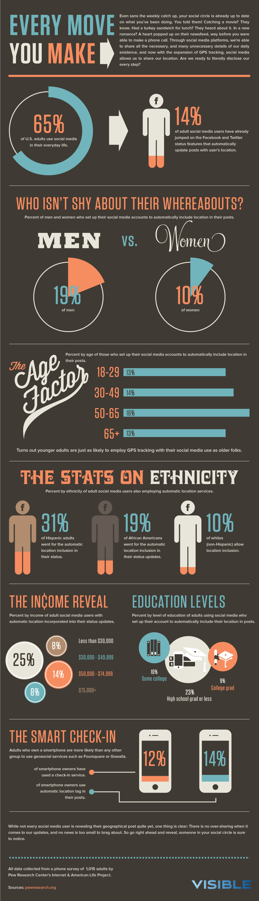
Exploiting the visual potential of appearance


The design on the right of the page is the final design for the title.
-
The use of color associations between words and visual shapes (e.g., the yellow-orange gold-ish) is a reference that the individuals (the clipart with dark-gray color) within the motherboard graphic (the green square with curvey edge) discuss technology-related topics. However, the concept of technology (e.g., developing and designing software) is relatively complicated to the general population, the final product's end receiver. In other words, the decision to fill in the shapes was a representation that what goes behind the scene is not familiar to the general users.
-
Additionally, the decision to use the yellow-orange gold-ish color for "IN TECHNOLOGY" is because the tech world is currently and will continue to evolve faster than ever. It seems almost impossible to live without technology (e.g., you need a laptop for school to do photo editing work or write a personal statement for school).
-
Another example is the use of green color. By nature, green represents growth, and green use in the tech world is obvious (e.g., the motherboard, RAM). Thus, a green heavy-weight line around the title expresses a message that social issues in the tech world still do not get a lot of attention but only continue to become more prominent (e.g., the gaps in technology accessibility under-representing women). Even if it does, the issues do not seem to progress positively. Lastly is, the outlines (the graphics around the low-details human and bubble speech icons) represent the motherboard/a computer chip, which is an implication this exists in the tech world/industry.
Iteration 1


In the given screenshot, the word "the" is rather small compared to the other two as it does not serve a meaning to the statement. Using the same analogy, I purposely keep the term "diversity" either smaller or larger than the word "technology" a bit, because it is still an issue that needs to be addressed in this field. Moreover, the choice of using an outline of a diversity picture, when shrink, it looks almost like the earth, but when you look closely, it is not. Similarly, the use of silhouette in these two pictures show that, when we look at an issue on a surface level, everything is less likely to make sense, until we started to look closer and what happens beneath an issue if we truly want to provide a more inclusive working environment.
Using thin lines and the level of details, I was able to do two things. One was producing an icon that looks like earth, represents for "diversity" with the benefit of the details. I utilized the Fill & Outlines concept to portray that, how we as a human being look different in the real world (which is why I kept the background of the picture), but when we look far away, we are no different from each other, just a normal human being.

I chose this background color because the idea of technology is similar to black (Cons) and white (Pros) concepts. However, technology lies in between the pros and cons, as it does not only provide benefit, which similar to the color of light-grayish. The graphic, text and line elements allow me to guide viewers to read my infographic in a way I would prefer. In a certain culture, brighter colors (yellow organe-ish) represent that matter has a high value, which lighter or darker colors (Black, grayish) consider as low or bad. In terms of the text colors, I decided based on the background, and how I want to portray a certain part of the infographic
Critique
Connor M.
In the appearance display, there are clear text size differences with different emphasis. The color palette allows “technology” to stand out and the black and gray stand out a little less, and there seems to be a lot emphasis on “technology” due to the use of color.
Prefer the appearance display with green-ish and golden-ish version because the colors skim seem simpler.
For the color, the yellow and green version emulated very well from the color model. Visual language model does not really apply to the appearance display, since it is just the title.
Critics when following the visual language (VL)/color style guide
-
VL: the way the contents are outlined fit more with the border lines and there is a decent amount of details. Perhaps, simplify the icons a little. Since the visual language is pretty simplified, it will be good to simplify the icons a little bit. Even when zoomed out, you can see the decent amount of stuff going, reducing some of the details in the center. Shapes are good and the first one (on the left) did a better job as it seems to align better with the visual langue model.
-
Color: the first one matched with the color style more, and second seem to use the visual language style guide. Overall, it follows the style guide well, with the emphasis in size and texts representation.
Response to Connor Feedback
I took Connor suggestion to reduce the number of details in the outline of the picture cut out if I want to use to ensure I follow my visual language model. Additionally, with the topic I am working on, it seems like simplicity does draw more attention easily. Other than that, he has a positive reaction to my color decision.
JoJo
“in technology” stand out with the use of the icon. “Diversity” is small in size, when compared to “in”. The font color is different in the second version (the left) and the icon look like a “motherboard”. In the first design (the right), the use of font and color to deliver a message, and the word “in” seem to be the same font as “diversity”. While for the second (the left) design, seem to the only color for the purpose of appearance displays. There is a slight change in color choices between designs.
Would prefer the bottom two designs because of the consistent use of font style that reminded an old school arcade machine that automatic associated with the term “technology”. At the same time, the different use of color draws the mind to it quickly. Moreover, the similar font style allows easier readability. In term of color preference, the second (the left), draws attention toward the display in a different way; while the first (the right), grayish represent something that cannot interact nor disappear, when thinking about the color existence in the technology world. The current use of the cut output on a big contrast in the current display.
VL: wide use of text variety and stick to one font, stick to one color.
- A similar style is used in the bottom two designs, which give it a little more emphasis.
- Doesn’t utilize graphics in the size of the text. Perhaps, moving the graphics somewhere else?
- Places that use technology icon, it’s a good place to use the cut-out.
- Stack texting, but in VL is more like compacted in certain text box style. For example, rectangle, triangle.
- Consider change around the text box style - like “Diversity in”, then “technology”.
Color model:
- Use a lot of green and don't see it in the appearance displays. It will be good to incorporate greener because of the association with “motherboard”.
- If using the color model, diversity = bright green color, and in technology = gray. ( the first – the right) follow the best.
- What do you want to bring attention to first?
- Play around with how big text.
Response to the JoJo Feedback
I disagree with Jojo interpretation of my color choices because not everyone has an understanding in the technology field, I aimed for a more general population would think when they saw the use of color. Hence, my decision for the text colors. However, I took on his suggestion and modified the way I organized my text because after looking closely at the visual language model, the way the text is organized is in a certain shape that does not take up too many spaces. I also changed the use of graphics because it does not seems to serve the purpose with the way it design, as it rather over complicated the title and make things look clustered after I discussed with Jojo and one other critics.
Maxine
The colors are complemented with each other. The icon represents the globe and replaced the “o”. The font is great, and it gave the “building” tool shape – remind technology. For the second example, cannot see what the silhouette represents and does not stand out as the “o” in the technology. “diversity” seems to be a different font compare the technology. The colors complemented are good, and so does the layout.
The left design, it does not fully mimic the design exist in the visual language. Would prefer the grayish and greenish color because it goes well together. The font of the “diversity” in the second example is its own things, and don’t see the connection to the “in technology”.
Prefer the first example on the left because the colors and icon work well with each other. Perhaps, use a different font for the “diversity in”, like the standard style. Would prefer the current use of the font for “technology” and the way it stacks up, perhaps change rectangle style textbook with two rows of stacking.
Visual Language:
-
The placement of texts – perhaps made it closer together.
Color model:
-
The appearance display emulated well from the color style guide for the first example (on the left).
-
When thinking of technology, it reminds people black and gray, while green color represents well.
Response to Maxine Feedback
Maxine feedback on my appearance display is somewhat similar to what Connor and JoJo have for me. It was a positive comment overall and I did modify my texts as suggested, since she was the second person who said a similar thing as JoJo about the text. She was also the third person who thinks my appearance display emulated well from my color style guide.
Anusha
Two different examples in both versions. Since they are different, it adds to the topic of “diversity”. The second thing that noticed was the “o” in both examples are drastically different, then realized the different fonts that seem to associate with “technology”. The color seems to be different. The second (the right) stand out more, perhaps, it’s the size. In the first (the left), the color in “diversity” is similar and its clearer. Font works well.
Prefer the first in term of style and color, but in term of size would be the second one regarding readability.
Color: emulated well from the color style guide. Not so sure how color is related to technology. For example, what does “blue” represent in technology?
Visual Language: “block” look like the visual language model and the style is condensed similar to how VL do. The fill up in design similar to the model as well.
Response to Anusha's Feedback
Her overall feedbacks, especially in term of color use, is somewhat similar to the others that gave me feedback and I decided to stick with the color from the Color Guide but using the simplicity from Visual Language model to recreate a title for my infographics.
Iteration 2


In these images, I would like to give viewers' the perceptions of how gender and race diversity in tech field need attention besides other current social issues. Using different techniques to put an emphasis like the line weight of text and size. The color that is chosen for certain text, including the arranges of text styles. The choice of using an outline of the diversity picture, when shrink, it looks almost like the earth, but when you look closely, it is not. Similarly, the use of the motherboard to represent for technology (as it is part of a system), with human symbols being put insides as a notion of how our current worlds revolve around tech. When we take away every other factor of someone (e.g. body features, appearance), they are just a normal human being with unique ideas/opinions that could perhaps make technology continue to produce more benefits to the general population.***
***For the purpose of the assignment, I moved both designs in one column. When I refer "the first (the left) design", I am talking about the top design where there is a graphic of a motherboard; the second (the right) design is the bottom with a circular border wrapped around the graphic.
Using the line styles from the visual language model, I used lighter line weight for the border of the graphic(s), and header to indicate the begin and end of the title. In terms of the level of detail and realism, the one on the left, I went the low level of detail, but enough details to show the realism of the graphic of what it is trying to convey. Similarly, I used the same guide for the second picture on the right. However, I reduced the number of details that will not cause viewers to feel clustered when looking at it. Moreover, my visual language model went with a basic and simple representation, I follow this aim because I think sometimes the best way to portray an abstract topic is to be as simple as possible, to prevent confusion or the feeling of overcrowding information with a "small" space.

Because I received positive reactions regarding the use of colors from this model, and I like the color choices, myself as well. I decided to stick with these color choices, as I am convinced it represents well for my topic of interested. Additionally, the use of colors and texts are somewhat similar to the visual language model. For instance, different size of text and color to put on the emphasis. I think the color choices represent well as I explained in Iteration 1.
"The idea of technology is similar to black (Cons) and white (Pros) concepts. However, technology lies in between the pros and cons, as it does not only provide benefit, which similar to the color of light-grayish. The graphic, text and line elements allow me to guide viewers to read my infographic in a way I would prefer. In a certain culture, brighter colors (yellow organe-ish) represent that matter has a high value, which lighter or darker colors (Black, grayish) consider as low or bad."
Critique
Connor M.
In term of the first design, was immediately drawn to “gender and race” phrase, then “diversity”, then “in technology”. Technology seems to be more important because of the use of size and color - larger and different use of color. The icon seems like there is a group of people that are discussing something, and they are in some piece of technology. Since it is inside some tech piece, it seems to infer they are talking about tech because the color is seeming to align with the use of color in technology, the similar analogy for the color association use between human graphics and gender and race diversity text. Like the fact that it is parallel with the fact that the text is inside the green line with people insides the green graphic.
For the second design, the “gender and race”, “diversity” and “technology” organized differently. Diversity in technology flow in on its own, while technology seems to stand out as a most important thing. In terms of the icon, it looks like a globe, but there are hands within and appear to join together when zoomed out, and the entire thing wrapped with a green outline, include the graphics.
Would prefer the first one a little between because the difference between the icon and text are unified, and the icon is more simplified. Additionally, the color parallel choice between the texts and icons.
Line treatment is similar, especially with the lines around the title. The shapes are similar because of the circle used in the second, while the first one is around the edge, which is similar to the phone icon. So, it is aligned with the icon. VL (visual language) seems to use fill more than the outline for graphics, it’s definitely easier to fill the shapes inside the text bubble. The one confronts more level of detail and realism are the one on the right in compare with the left one. The color matched well. Although the smaller text is in green in the color guide model, it is not relevant in this case because the focus is different. Typography, letter form on the left look match and look similar. Though, in the VL model, it looks thicker. The one in the model also seems a little more condensed. It's legible, the way it’s put together and salience.
Response to Connor Feedback
Connor second time giving feedback was quite positive. One thing I did not notice was the color parallel until he pointed out - the same use of color on the people's icon with "GENDER & RACE DIVERSITY", and the speech bubble with "IN TECHNOLOGY" which inferring/give an assumption that they are talking about tech related. Other than that, Connor prefers the first design, which I noticed (as I got feedback from others as well) the color choices were what allows people to feel pleased when they looked at the design.
Shan J.
Assuming the appearance display is the title of the infographic and see that the texts were wrapped in a rectangle text box style. In the graphic, there are combinations of round shapes and squares. The people's icon represents for people and they are in the same group/ space, and they communicated well with each other.
VL: in the VL, it uses a lot of solid colors and the combination of outlines and solid color (fill). In the graphics use, there is combination use of round and square shapes, which is similar to the use of these shapes in the first design (on the left). The text matched with the “The Smart Check In" header in the VL and look like it is just a regular text font. Compare the first (left) with VL, the two lines wrapped around used in a similar manner as the model, except different weight. In the second (right), there is a hand or maybe several hands holding together. The graphic also shows the connection, communication in the group. The same use of font style for “Gender & Race”. The “Diversity in Technology” seem to be bolder in the regular style of the text. It’s kind of similar to the text style choice for “The Stats on The Ethnic”, expect the curl. The size for the phrase “Gender and Race” – kind of too small. Texts are separated into two blocks for the first, while it is three blocks for the left design. The color matches the color model, regarding the way it is being used.
Likes the graphic in the first design because the graphic in the second design has too many details within, when people first see it, they might need to zoom in to see what the graphic is. The graphics used in the first design are more simplified. Likes and prefers the combination of the texts and graphics are combined in one block arrangement.
If adjusting the text arrangement style, it is depending on how much space is available, it does not put too much different if putting the texts in two or three blocks.
Response to Shan Feedback
I like the idea when Shan talked about "simplified" and prefer the first one because of the graphic design. After evaluating her feedback in combination with Connor, because even though my idea is abstract, but the simplicity of the graphics and text organization allows the display to speak a lot for itself and represent well for its own purpose. I also adjust the "GENDER & RACE" to slightly larger because, from her feedback, I realized how some people that have vision struggle will have a hard time to look at things that are (1) over complicated with details, (2) smaller texts. With these considerations in mind, I modified the text size slightly and decided to pick my first design as my final display.
Dillon Z.
The first version looks pretty straight forward, big text and look like a header of the page (title) and align next to graphic. The graphic inside has people talking that’s not words and in some sort of tech pieces, align well with the title.
Like the front, which is readable. “Gender and race “fonts are small and seem to try to fit in the borders. Perhaps, change the size a little bit because right now, it looks de-emphasize.
Would prefer version 1 (left) because, the inconsistency in version 2 (right) made it a bit “unpleasant” to look at like the choices of text style and the level of details that are used in the icon.
VL/Typography:
Fonts match well with the model for version 1 (on the left). The font looks a little heavier weight compared to the design, which is not huge deal.
For version 2, different pixel font, but it does not match the model anywhere. In terms of matching with the typography model, first one did a better job. In terms of visual language, it also seems to match well with the design like the use of graphics choice – people, and basic geometric shapes, which are a nice similar level of details with VL. Using a lot of outline shapes and not filled, while VL model used fills not outlines. Otherwise, it is very consistent
Color:
The color choices quite well, which matches with the color model. Give a nice interesting contrast that draws viewers' eyes, but still very readable. The model uses the roughly same amount for all three, and have more white texts on background, and seem the VL does not has that, so it does not seem to be a problem. Other than that, the designs are consistent with color models.
Response to the Dillon
Dillon made a good point on how I did not (really) fully follow the visual language model because when looked at it again, my design used more of lines/ outlines style to build my graphic rather than filled. With this reflection in mind, I decided to fill a certain part of the graphic like the circle that represents a human head. One reason is since I could not figure out how gender should not be a problem in the tech field because diversity brings efficiency. Filling in the circle shape is similar to when you look at someone far away, you do not know how they are and what are they until you move closer. I decided to fill the shapes that contained inside the speech bubble because, to the outside world (those who are not in the field), will not fully understand, except its a blob when it's come into solving the problem in tech field or develop a new technology to benefit human's life. Similar to the previous two, Dillon prefers the first design because of the colors and simplicity.
Final Revision

In this design, I would like to give viewers' the perceptions of how gender and race diversity in tech field need attention besides other current social issues. Using different techniques to put an emphasis like the line weight of text and size; the color that is chosen for certain text, including the arranges of text styles. The use of the motherboard to represent for technology (as it is part of a system), with human symbols being put insides as a notion of how our current worlds revolve around tech. When we take away every other factor of someone (e.g. the body features, appearance), they are just a normal human being with unique ideas/opinions that could perhaps make technology continue to produce more benefits to the general population. Filling in the circle shape is similar to when you look at someone far away, you do not know how they are and what are they until you move closer.
Although my idea is a really complex abstract concept, the simplicity of the graphics and text organization allows the display to speak a lot for itself and represent well for the purpose I had in mind (as explained previously). The same use of color on the people's icon with "GENDER & RACE DIVERSITY", and the speech bubble with "IN TECHNOLOGY" served as an association that, it's a group of people discussed technology issues. I decided to fill the shapes that contained inside the speech bubble because, to the outside world (those who are not in the field), will not fully understand, except its a blob when it's come into solving the problem in tech field or develop a new technology to benefit human's life.
Using the line styles from the visual language model, I used lighter line weight for the border of the graphic(s), and header to indicate the begin and end of the title. In terms of the level of detail and realism, the one on the left, I went the low level of detail, but enough details to show the realism of the graphic of what it is trying to convey. I reduced the number of details that will not cause viewers to feel clustered when looking at the infographic.
Moreover, my visual language model went with a basic and simple representation, I follow this aim because I think sometimes the best way to portray an abstract topic is to be as simple as possible, to prevent confusion or the feeling of overcrowding information with a "small" space.
The use of fills shapes is similar to the idea of everything is being covered and you cannot tell what is beneath.

Regarding the use of colors from this model, I received similar comments from the critique sections that these colors go well with the topics, especially with the abstract concept. I also like the color choices, myself as well. I decided to stick with these color choices, as I am convinced it represents well for my topic of interested myself. Additionally, the use of colors and text styles are somewhat similar to the visual language model. For instance, different size of text and color to put on the emphasis. I think the color choices represent well as I explained in Iteration 1.