Exploiting the visual potential of numbers


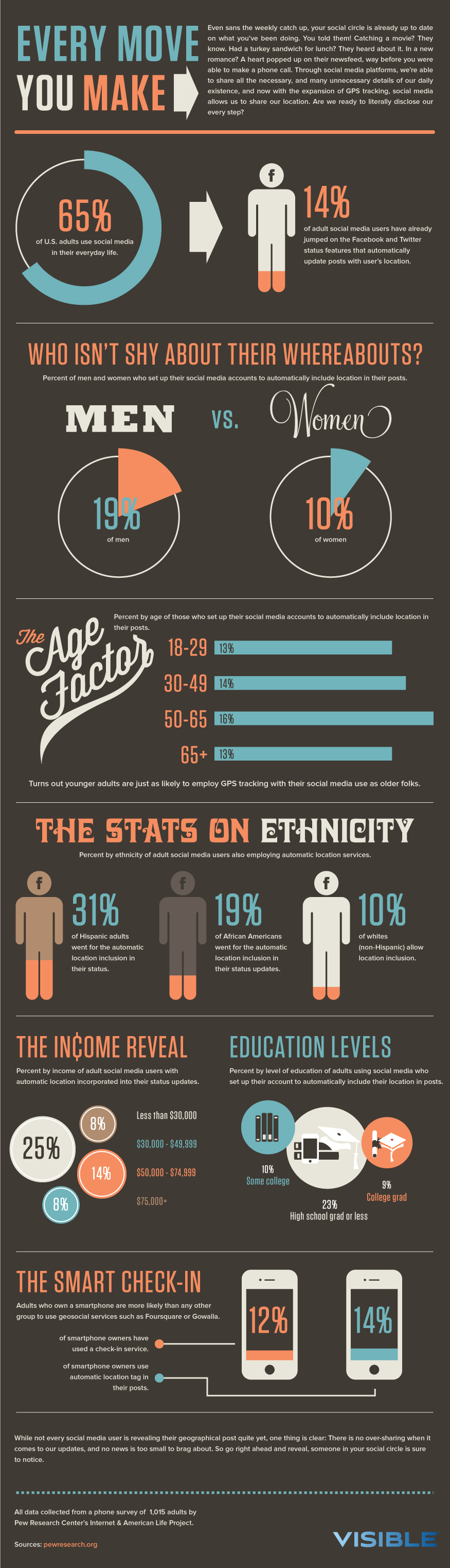
After looking closely at my visual and typography model, I acknowledge the simplicity in information visualization through the way to play with words, colors, and graphs. For my final iteration (farthest right), there might seem more texts than the previous designs, but I think it is necessary as it served as alternative information that helps the viewers to make sense of the graphic. This design was going off from the "THE AGE FACTOR" on the visual language model. In this graph, the use of a teal green bar to represent the information of certain demographic out of 100%. While the height and color are similar, the differences are, 1) the y positions of the bars - to provide a general visualization that the actual percentage of that race in that studied Computer and Information Science major in the 4 prestige universities; 2) length, size - in terms of geometric shapes like rectangle, these two encoding methods is one way to express how big or small the content is, and easy to understand like how the visual language did it. A take away the viewer should be is the percentage of White in the tech fields might be something that embedded in our education system - why this field is dominated by White and followed by Asian.
Iteration 1


The intention of these designs is to emphasize the disproportion of genders in the tech field. All these values are based on the average values available to the public from the top 23 well-known technology companies (e.g. Facebook, Instagram, YouTube, Apple, Microsoft). For example, the purpose of indicating the percentage of the overall population should give a general image for the general public to see that even though the female population is dominated by 2% in comparison with the male population. Yet, the male seems to dominate in this industry. While the second design shares the same intentions, but it is the average value from the popular social media sites companies like Facebook.
For both designs, I went with the visual language model like shapes, and similar body font with this model. Furthermore, this model led me to come up with these designs because of the simplicity in this guide. For example, the design of smartphone at the lower session.

For the first design (on the left), I decided to go with the colors for this model because I think it will allow the texts to stand out more. This way, it provides a clearer image of "what is the genders proportion (male and female) in some of the well-known tech companies (e.g. Facebook, Instagram)?", due to the text use style in guide as well.
Critique
Hedy
-
The first design (on the left): First thing noticed was the two pie charts, one represented for men and one for women.
-
It is clear that more men in the tech field as it shows to take a large slice of pie, since it has more percentage, while women are less than. The second thing that brought the attention to was the title and the subtitle – what the values represent for.
-
Then the attention shifted to the details of the pie chart and which eventually led to the focus on the notation at the bottom – as it said to provide information about the U.S. population (of both genders).
-
It is a little confusing, because the whole pie chart represents the whole male population (outline), while the male slice represents the percentage that works for the companies. It does not fully make sense because the notation is confused like why is it there? What is the relationship between 49% and 64.1%? (Same thing for the women).
-
-
Like the slice that out of the pie, it gives the feeling a 3D – like the designs.
-
-
The second design (on the right): The similar use of the title is confusing, consider adding the term “social media”. At the same time, able to see the reason the men in relation to the women in a tech field better, but the gray area did not have label lead to assuming it is referring to those who did not define.
-
Preference: Definitely like the example 2then the first 1, because the notation, the information is proper and not so big that will get attention easily. This design also Provided more information that understands the design better.
-
Visual language: The difference between the first design is the percentage and info in the middle of the pie chart, rather than on the slice. Considered removing the caption bellow the percentage because it is not necessary with too many words, as the title and other labels did the job. Additionally, play around where to put the number (like following the model, for example) because of the white balance.
-
The font seems to have the intention that trying to match the typography, but definitely able to get the difference, “Men” and “Women” simply through text. The design on the right: it is good because the labels were used in an intuitive sense. Other than that, it is good in general.
-
-
Color guide: The main colors that were chosen are yellow and green. The colors were used to differentiate different genders, while gray was used to represent for other parts. The gray color for the text, and consider using darker gray because of the readability. Additionally, consider changing the color of texts like “Men” match with yellow, “women” match green as it will match more with the model.
Response to Hedy Feedback
In responding to Hedy comment regarding the purpose of notation about the gender population, I kept it there because I want to show or address that, although the women population is approximately 2% higher than male, how is it possible that there are more men representing in the tech industry. This should raise questions in people's mind is my intention with the notation.
The reason the gray area does not have any labels was not an intention, it was more of an "I forgot to label" and I also meant to address that even if there are data about diversity in tech, how reliable can it be since they do not (seem) to include almost everything. For example, our society has become a place that has more than two genders, and this is something does not seem to address in the data related to this field.
Taking Hedy Feedback into consideration, I modified the design to become closer to my visual language (VL) model a little more than before. For example, play around where to put the numbers and change the pie chart style to be similar to the VL. Another thing was I did my best to reduce as many words as I could. However, in iteration 2, the number of texts intention is more to help understand the data a little better. However, I did not change the color of texts like her suggestion because when I play around with the graphics, the black/ dark gray texts is more preferable due to the contrast it giving.
Khoi
-
First version: See the genders proportion text field as a title for both with a subtitle. The second thing that got his attention was the “Men” and “Women” – big labels, while men label is much bolder, and women is less bold, italic and cursive. Then noticed the 64.1 with the text in bottom that’s too little compare to rest. Consider making it bigger. Then, immediately notice the population measurement. Similar with the women graph, the text is small.
-
Second version: the title and subtle are easy to nice. Men has a biggest a portion because it has 63.2 with a leading line. Second biggest session is women with another leading line that lead to a more italic font label. The caption at the bottom is easy notice but reliability is still difficult because of gray color, contrast with white.
-
Prefer: the second, one pie chart convey a better message in compare with the first one, it is confusing to understand what’s trying to convey. Especially, the low readability. Also, has a unity as a one chart, with the contrast.
-
The use of color is good, and white stand out pretty well as it follows the color model well. The fonts used in the design is good and emulated well with the both (visual and color) models. Annotation font and color are consistent.
-
Add a little more color for the title because the title for VL has some color in them. Consider split the gender into two colors – male: yellow, women: green (for example).
-
Playing with the title – color choices.
-
Response to Khoi Feedback
Due to the fact that Khoi was not the only person seems to notice the subtitle before the title first, I enlarged the title and put more emphasis as much as I could. With the consideration of preventing confusion, and provide a higher level of readability, I did my best of minimizing the number of words I included and arranged the contents in a way that is more eyes pleasing as seen in both designs. Furthermore, taking into his suggestion, I did play around with the color choice and split in the word "gender" into two different colors and II definitely like it. Also, when I looked back at my color model, I do see the same strategy is used in the model. However, it is kind of hard to spot on the model. Overall, his suggestion led me to play around with the use of colors and the visual language/ typography a little bit that I personally feel like not fully following the models (probably like 60 - 80%) seems to work better for my topic is what I realized.
Leo
-
From the left design, Leo did not see the title as first, since the attention was being drawn toward the “men” label, and then shift focus back to look for the title. Based on the title, got an idea what’s talking about.
-
Two pie charts: one described male population percentage and another pie chart with a small portion in green – cannot tell what the two pie charts are communicating. Assuming, these two charts should interpret together because did not see the text below the percentages, but when paying close attention, noticed the smaller texts.
-
From the right design, it’s clear that one pie chart is dominated another based on the visual presentation of slices - the men percentage. In comparison with the left, one is working in tech – male v. female. One is a direct comparison of men and women working in the tech field.
-
Wonder: if the gray area is representing the LGBTQ+ community or it just did not specify.
-
Preference: the right one because of the way it is present that is easy/much better to understand. In comparison with the left one, the readability is not well – for example, having to zoom out the image, in order to view the text under the percentage. Also, like the sense of aesthetic from the right design because of personal preference – no outline.
-
Visual Language (VL) and Color Guide (CG):
-
In terms of VL, did a good job following the VL. In terms of font, it’s pretty close because for the font for “Women” is not exactly the same (not the main concern). The use of the outline is similar to the VL. Compare the display with the VL, the way the percentage aligned is right in the center. Don’t have a pie chart that’s similar to the design on the right and don’t have a comparison in their pie chart(s). If was to incorporate the right design, replace the gray filled slice with an outline.
-
In terms of following the CG, the designs follow well and see where the colors are coming from. Also, the colors contrast each other well. The different color on the label tag is bold.
-
Response to Leo Feedback
Renee
-
The design on the left: Immediately, notice the title then the subtitle. Then the attention was drawn to the two circles, started with left one and a part of the circle removed from the circle, with a number inside it that’s large, while there is smaller text, along with the label of male population. For the women pie chart, there is a similar design/concept.
-
A bit confusing. Perhaps, consider a third chart but the idea is to convey how that there is this X male in tech in related to the US population, while there is this much X female in tech field in related to the US population.
-
The design on the right: Easier to understand since there are no stranger text popping out. Also, these values – assuming the employees at the social media site companies. Shared the similar texts and title to the design on the right.
-
The subtitle below is slightly different and it has a clear indication of what the percentage represent for.
-
Circle – one, women and men are in one pie chart. However, space is different. For instance, women have a bigger radius, which make it easier to understand the different in size, while the gray area indicated “other/undefined” and not really mentioned. There is a small annotation at the bottom. The annotation explains what the pie chart mean. The design keeps the similar at the first display.
-
VL: the use of “men” and “women” in the design emulated well from the VL. It has a similar emphasis on genders. The similar san-serif font for the number like percentages. The smaller subtext shared the similar style in the VL. The first design (on the left) follow closely to VL. The label of what the outline circle represented for, provided a better understanding toward the design.
-
The second design look more variety as it different from the VL.
-
Color: closely followed the model, good job.
-
Prefer the one on the right because it provide a sense of united since it portrayed an image of one graph. However, it’s kind of hard to tell the different. The one on the left has more unity because it allows you to compare them easily.
Response to Renee Feedback
In response to Renee's confusion to the first design, I did not think to make the third chart was necessary. One of the reasons was I created this displays thinking it should address the relation between data, which could make sense why the visualization is confusing. Even for me, when I looked at it the second time and think about how I would change, I was confused myself. If I am confused about my own work, I do not expect others can see my intention well either. This is something I noticed very consistent throughout all four feedbacks. The organization of the data and how to express it led to confusion. Additionally, I noticed that it seems like everyone prefers the right design (not only Renee). So, for my Iteration 2, I sort of used the right design as a guide to express my idea and how I want my viewers to look at my work.
The gray area does not represent anything, it just did not specify and I should of label what is the purpose of the gray area to prevent confusion. Additionally, one of Leo main concern was the readability and it makes sense why. With this thinking in mind, I did my best to make sure the texts are large enough and removed information that does not make sense to myself (as it will more likely do not makes sense to the public viewers either). However, there might be more space to improve with the use and organization of the text that I have not figured out yet.
Iteration 2


When looking at both designs at the same time, I want the viewers able to finish the sentence - "I just learned that white individuals are the leading groups in some of these well-known tech companies, and it seems like men are dominated. Could this indicating that white individuals who also identified as men are leading this industry?" - without any other details. Even when they looked at these two designs separately, a similar kind of questions (hopefully) will raise in their minds were, "what about those who do not identify as men or women?", "why is there are a low percentage of Black and people who identified multiple or other works in these popular tech companies?". The purpose of I am trying to do with these designs is pushing the viewers to pay attention to the social issue side of the technology and how they can play a role in ensuring these companies (and others in progress) provide equal opportunities/ focus on diversity in tech. At the same time, there are people might not care as much.
The way I was going to encode my visual attributes for the number display in the first design was using a line chart. However, after playing around with the line chart for a bit with different years of data. I realized how it does not make sense, in addition to making information harder to interpret. Then I tried with the horizontal bar graph after looking at the visual language closely. As the result turns out to be pretty pleasing, I decided to stick with it. My decision of keeping the title and description of the charts as a separate section because it seems to balance the white space better, and look cleaner to my own perception. In contrast, the second design was followed closely to the visual language and it makes the most to use a pie chart because it is talking about a certain portion. However, I went with the first version of the pie chart (the one with the filled outline) because when I play around with the color on the pie chart, it does not make the information hard to read in compare, if I organized the data/ information similar to "WHO ISN'T SHY ABOUT THEIR WHEREABOUTS?" section.
For the first design, I did not use any lines. However, I did use the filled rectangle shapes to express the information on how individuals identified as White is the group with the highest percentage of these well-known companies (even when I aggregated all of them).
Similarly, for the second design, I use some filed shapes, but not as much as the model did. I used the filled shapes to show how much the proportion takes up if we putting on a scale. In this case, it is 100% since the measuring unit is a percentage. The use of line is a way for me to express a full portion.

For both of these designs, I did not put much of my attention to the background color.
From the first design, the use of color of the phrase "RACE FACTOR" is from the light green line (thick weight) coming out from the faucet. Although in the color guide there is no text used this color. I intentionally used this for the race factor phrase because, to some people that this is not an issue to them. Yet, it is starting to become a burden for many people to "access" opportunity. The use of light green is more of an indication that this issue is growing, but not a lot of people 'truly' believe it (this is speaking from what my observation and personal experience). The use of the turquoise/ teal green/ orange alike color for graphic like the bar (in the first design) and filled line (in the second design) idea was definitely coming from section 5 of the guide. Though they use the size of water drop shape to encoding their data attributes, I did it with the pie chart and bar graph.
The text colors are definitely coming from the color guide. However, for the use of a color like "gender" definitely needs to look closely in the guide to spot it.
Critique
Kimberly
First: See “THE RACE FACTOR” title with the white backgrounds. Then noticed the phrase “RACE FACTOR” is bigger than “THE”, and everything is in bold. After noticing the title, attention was drawn to the caption/texts under the title. Then shifted the focus on the bar graph and see that “54% of white people work in the tech and correspond value for the race”.
-
It is a horizontal bar graph that has the same color use (teal green for the graphics and white texts) throughout the design and similarly for the label. The text is almost the same height as the bar, considering twisting it a little to provide more space.
-
Suggestion: Be careful with the typos. For example, how the word white capitalized in the description, but not for another race, remove the asterisk. Also, maybe considered using different fonts for the labels inside the bar graph and remove the percentage on the y-axis labels.
Second: See the title, the first thing catches the eye is the split of colors used for the term "Gender" - it’s kind of cool. The whole title is written in capital letters and bold.
-
All seems to be in Sans Saira Fonts; then carry on to the description under the title; then notice the word “MEN” in bold black and very blocky, followed by the “WOMEN” in a different font, thin and cursive style and written in the black.
-
As far as the graph, there are circles and a filled circle outlines and refer to the percentage inside the circle. Furthermore, used reverse color. For example, teal text and orange filled circle outline for the men, reverse for the women.
VL: The first was mimic of the “THE AGE FACTOR”, and they don’t use percentage on the label and bigger font for the axis label, while smaller on the bar. The caption on the top, but on the design, the caption is arranged on the left. In the design, the title is horizontal, while the age factor title is slanted. Additionally, the design has more text than the visual language model does. Upper and lower cases for the title are seemed to be used in the model, while the design used all upper cases.
-
For the second model, the design does mimic, a mixed of use of the top 2, 3 sections' graphics, and the same use of text for men and women. There seems to be more space in between on the VL, while the design does not seem to do the same thing.
-
The way of labeling the number and sub caption inside the chart, include the “VS”, are similar, but the VL is bolder. Additionally, the title and subtitle/ caption is center aligned. Though your design looks like it is left aligned.
Color
-
First: The faded teal green that does not use in the model, but it is used in the title as the mode. The use of color:
-
Teal – graphics
-
Orange/lighter teal green/white/dark gray – text.
-
White – background
-
-
Second: the used of dark gray/ black color for texts, and orange and green divided in one word, it does not seem to exist anywhere in the model. Perhaps, consider playing around with the colors a little more.
Preference: The second model because it is easier to interpret and like the gender thing, maybe there are other ways to work with the split colors in a word. As it also follows well from the VL. While for the first model, the sub-title/caption in the first model and percentage symbols sort of throwing off attention.
Response to Kimberly Feedback
Taking into her suggestion in mind, I went back to analyze my visual language and typography model when I did my final iteration and noticed that the font style that uses for text, it is a bit different than what I used for the graph. I modified the font style for all the texts, except the title. I also keep the percentage and the y-axis labels together because I think 1) it keeps the viewers' attention together, rather than dividing their attention; 2) it looks less confusing. I decided to go with the first one because I think the design is clean. With that being said, I did take her suggestion of reducing the number of words (following the visual language model) and fix the subtitle/ caption, including the percentage symbols to increase the readability of the design.
Anusha
First
-
See the horizontal bar graph and the second goes to is the title. Noticed there is the subtext. The title is the only thing that is in the upper case, while all the subtext seems to be in lower case.
-
See the percentage come before the words in the y-axis and it throws off. Additionally, the “Multi & Other”, it takes up two rows which look like two different categories.
-
The bar graph organized from the highest to the lowest.
-
Suggestion:
-
Having the percentage all align, it looks kind of weird. Consider moving the percentages to the end of each bar because of the white balance.
-
-
Information seems to be heavily aligned toward the left side and texts are in different colors, and the y-axis is lower case. The axis font and the number of texts are the same. The title is the only one that seems to be different, in term of the use of texts and font styles.
-
This design provides a higher sense of unity.
Second
-
The first thing goes to be the charts. The colors are inverted, for example, men have the turquoise number with orange for the circle outlines to represent the information.
-
The font for men and women is very different from each other.
-
Men – bold and thicker, all in upper case.
-
Women – cursive and thinner, all in lower case.
-
-
The second thing goes to is the title and the use of turquoise and orange for the word gender – like it.
-
See the small words – sub caption, and “VS” is kind of weird because of the color use, the way it organized. Also, the way the information layout seems to be somewhat all over the place due to the use of colors and font styles.
Prefer: not sure how to judge since they both are designs of different content, but would prefer the second one because it is visually appealing. However, the first one is easier to read.
VL - visual language model
-
Looking at the VL can see where the second and first designs come from. The only thing that departed differently from “THE AGE FACTOR” section. In the design, the race factor seems to emulate from this model. However, for the design the title is all in upper case; the percentage labels only exist insides the bar graph, including the organization of the title, is slanted. The subtext, there are split comments at the top and bottom, while the design has all aligned to the left.
-
Second: The pie charts are somewhat different, the fonts and everything used in this section and the actual pie graphs is more of a combination of the second & third sections of the VL model. The numbers are connected with the pie graphs, which is not similar to the design. The font of numbers seems to be condensed and bold. The title is in two lines, while in the model, there is only one line.
Color
-
First: The use of orange and turquoise, including white texts are obvious where it is coming from. A little confused, where does the light blue color come from? The subtext is a dark gray color which is similar to the model.
-
Second: The same use of turquoise and orange used for the pie chart and label, and the dark gray for the title, with a white background.
Response to Anusha Feedback
Since I decided to go with the first design for my final iteration, I moved the percentages to the end of each of the bar graphs to make it look like it is not heavily aligned the toward left. I do agree with Anusha that the first one is easier to read (minus the typos), and the second one is more appealing. With this information, I incorporated feedback from others to work on the final iteration.
Renee
-
First:
-
See the title “THE RACE FACTOR” with a small description. This one emphasizes the percentage of white people in the tech workforce, as it also emphasizes the Black and Multi and Oher.
-
White background
-
Green graphics
-
Orange texts, and white texts label – percentage.
-
The RACE FACTOR and the subtitle are one section to explain for the graph.
-
Pay attention to the typos.
-
There are a lot of colors going on.
-
-
Second: the first thing noticed was the title and it was mostly one color, except the gender – a split.
-
Then shifted the attention to the small description.
-
Thirdly, there are different fonts that used for ‘MEN’ and ‘WOMEN’ – one is bold and the other is cursive and delicate like. Then there is the ‘VS’ in the middle that seems to share a similar font as the title.
-
Noticed there are two pie charts, with the filled lines of how far they go – for example, 64.1% of men and the orange line follow up.
-
Cannot figure out what the percentage is in relation to – consider including the “average” in the title because it is too small.
-
-
Preference:
-
Like the “THE RACE FACTOR” because of the use of colors, and it is bigger. It is easier to read.
-
There are the pie charts, which look quite nice. This one is kind of hard to read because of the arrangement and size of texts.
-
-
VL:
-
First: the similarity that can be easily spotted in the VL and design is “THE RACE FACTOR” and “THE AGE FACTOR” section. The difference is the title is cursive in the VL and slanted, while the design. Next thing noticed from the VL and designs is similar, the organization of the bar and the label of the y-axis. Remove the percentage on the y-axis label in the design because it is not necessary, and it seems to overcrowd. Especially, it is not on the model either. Like the way thing organized in compared with model because it is two different things to read and look nicer. The typography also seems to be matched with the model as well.
-
Second: there are similar pie charts that can be spotted in the VL, the number and description inside. The title is all caps and it is slightly bold. In terms of typography, it is a bit different, but it still emulated well.
-
-
Color guide:
-
First: see the use of green and orange, including light blue. The light blue did not use for the font, but personally like how it is being used for the title. The colors used follows well from the model.
-
Second: can see the split of color used in the color guide and it matches well.
-
Response to Renee Feedback
Renee suggestion about how I can improve my design and make things easier to read are similar to Anusha and Kimberly. One of the major things I definitely did for this design after looking at all three feedbacks was ensuring the layout of my design match at least 50% with my visual language.
Final Revision

This graph was going off from the "THE AGE FACTOR" on the visual language model. In this graph, the use of a teal green bar to represent the information of certain demographic out of 100%. While the height and color are similar, the differences are, 1) the y positions of the bars - to provide a general visualization that the actual percentage of that race in that studied Computer and Information Science major in the 4 prestige universities; 2) length, size - in terms of geometric shapes like rectangle, these two encoding methods is one way to express how big or small the content is, and easy to understand like how the visual language did it. A take away the viewer should be is the percentage of White in the tech fields might be something that embedded in our education system - why this field is dominated by White and followed by Asian.

In this design, there are not line styles, textures, level of detail and realism incorporated since it is based on a specific section of this model - THE AGE FACTOR. The use of the rectangle shapes was a great way to express statistic information. While the title of the graph is cursive, I went with the family font that is similar to another section title like - THE INCOME REVEAL, and organized the same kind of style. The only difference is, my work layout in a staircase style, while they are more clustered together in a square shape.

The use of the off-white color made the design is a bit dull. So, the background color is closer to look like white. Then I noticed the color for the title (poster) and the graph title from the visual language are similar. Taking advantage of this information, I did the same thing for the design title. However, the dark gray use for "RACE FACTOR" has a subtle implication that this is a growing issue in the states and, right now, it seems like nothing has done to protect the disadvantaged others because of their race. This is also a consideration of "THE" in teal green. The use of yellow like color for the percentage was coming from the last part of the poster where it said "50% ....", I thought that was a good way to put more for the design. Hence, the decision of yellow color for the percentage texts, and black color for the labels.