Exploiting the visual potential of layout


Since I elaborated how I utilized the arrangement/groupings/size of elements to guide my viewer through the infographic in details at the final iteration part, please refer for to that part for more information.
In summary, the first two designs were about exploring the possibility of where each information could fit base on the layout guide and the arrangement for each visual potential infographic. Then, the next two (top right) was about exploring the possibilities with colors and delivering the messages. Followed by the last five layouts (the bottom role) were about challenging myself to make sure my final layout does not depart too far from the model and still do what it needs to do. However, the first thee (to the left at the bottom) was exploring the different strategies to deliver the data and how I leverage the color guide to highlight important information. This way the viewers do not need to put in a lot of effort to interpret the layout. The last two designs (at the bottom row) were about ensuring different visual potentials portrayed in a way they should be to prevent confusion and how can I show the relationships of these factors that were reported to accounts for the low rate of women in the tech field, to the wide gender gaps in terms of completed a degree/certificate in this area.
Iteration 1


After spent couple hours playing with the layout guide, I had and my layout guide was similar with my color model, I discovered this layout seems to convey the message the most, make sense, allows white space to balance all the colors that are used on the design. As much as I love to follow my layout guide, my topic did not work. Instead, these designs were emulated from both the visual language (45%), color guide (45%) and layout guide that was completed for an assignment (10%).
For instance, my layout has 3 sections that are the same size and 1 large section, then the different subsection. When I arranged the graphics and information around according to the smaller boxes as well, it works for a section like "WHO IS LEADING".
In layout 1 (left), the section that used maps and divided into three different parts, the way it organized was coming "WHAT HAPPEN WHEN THE RAINS FAIL?" section of the layout/color guide. Due to the fact I could not figure out how to break down my information to fill-in information in a similar spot. I decided to join all of them together, but the way it's organized was followed my visual language, including, the use of shapes, titles, and the use of color styles. After this experience, I found out that organizing my information similar to my visual language model will make more sense but I want the design to be easy to follow. So, I play around with the way the titles label and positioned from my color guide. By accident, my design did have similar sizes (in a sense) to the layout guide, and the way of information organized for two to three sections fit the small subsection.
Layout 1, a somewhat mid-weight line is used to guide the viewers' attention intentionally on how they should look at the visualization.
In Layout 2, different line weights were used. For instance, in section 2, an extremely thin line is used to break the answers to a question in a smaller section and help with space managing.
For both layouts, the only low level of details and realism was used is on the map, to plot an approximate location of the institution with a subtle message that the low rate of female completed their study in the IT (in general) are low. Another similarity was the heavyweight line to divide the title and the rest of the sections. Thin lines were put in used as a way to connect the information to a destinated spot - to show an approximate location of the universities on the map - with the purpose of keeping everything inside and look clean. Another example of line style was used is the use of mid-weight lines to connect the dots on the graph to show the relationship and data trend. The uses of fill-shapes good for different purposes: 1) plot the position of the records on the graph; 2) categorized certain focus together; 3) allow visual comparison along with statistics value when looking the poster.

Revise this text to describe how you've chosen colors for the background, text, lines and other graphic elements to emulate your color model.
In both models, colors were used in a way to highlight information. For example, on both designs, the yellow golden-like color was used to highlight the percentage of women working in the well-known tech companies. Another example is encoding the data - golden yellow-like color for women, while tealish green for men. At the same time, different colors were used to categorize different aspects as shown in "THE GENDER BIAS TOWARD FEMALE" section.
In Layout 2, the golden yellow-like color was used to highlight the race group that is leading, in terms of completing a degree/certificate in IT (in general). Other than that, the arrangement of colors was used with a color focus of increasing the contrast of the design and more eye-pleasing when looking at it. For example, the decision of keeping the US map filled with teal-ish green color because so far, that's the only color that does not cause discomfort when looking at it, along with other information that is put on top of the map.
Critique
Simon
Layout 1: Noticed the title, then there is an arrow point to the right which you have addressed there is a description of the visualization.
-
Then follow by the section title, which it's interesting to see how it can also use to divide the section.
-
Then moved to the last section, “OTHER POSSIBILITY” – this shows the distribution of “women” that graduated with the IT degree.
-
From top to bottom, learned that the first thing highlight is the inequality and very consistent with the title. It already set the tones of imbalance/or something going on that is not paying attention.
-
There is no unclear information, as they are built up to the main point, which is the diversity of tech.
Layout 2: see some changes in color.
-
This gave a higher sense of contrast. For example, different shades of green and the section titles are different colors. Another section was added that seem to have a purpose to tie it together.
-
The label of men and women helpful to know which graph is talking about which population. In compare with layout 1, the need to zoom in was necessary to know which population it is talking about for the section that used pie-chart like display.
Visual language: For instance, the use of caps and aligned on the left included the use of certain graphic, the arrow, for the top section.
-
The use of heavy line was incorporated to divide the sections.
-
The first graphics emulated well the section that addressed both was men and women statistics, while the display is changed slightly, it still conveys the message it needs to do.
-
Used the same texts treatments with men – being really thick filled out, boxy font, while it is cursive for women.
-
For the second portion, the title of ‘THE STATS ON GENDER’ seem to be Saint Sairive font that is extremely thick.
-
Follow the layout with a larger one and smaller one at bellow it.
-
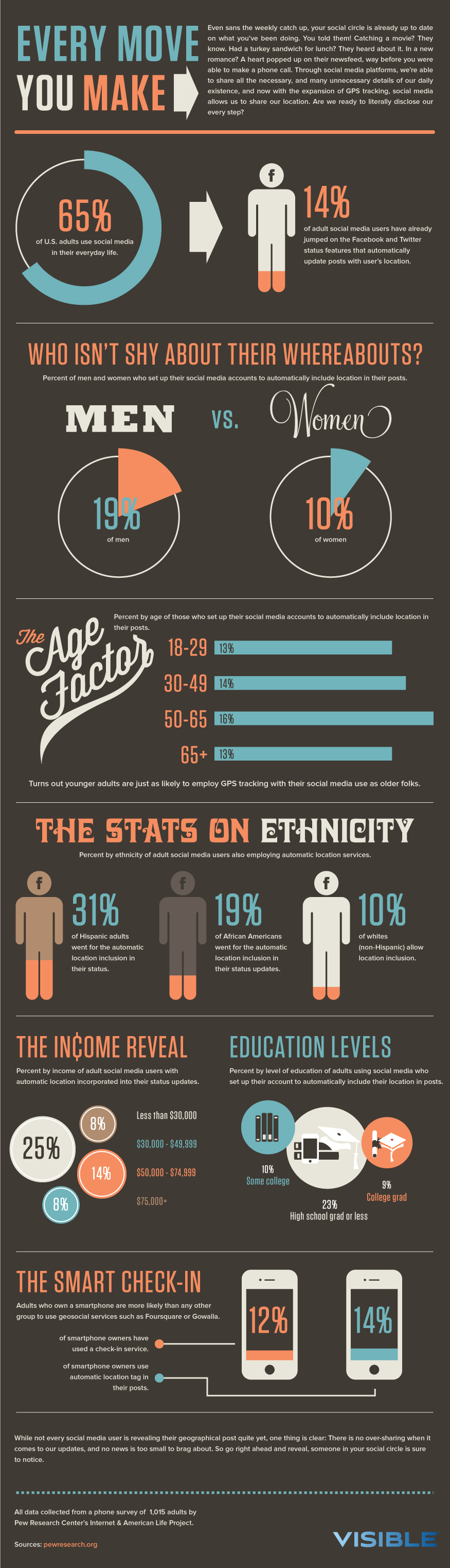
For the bottom, noticed it sort of followed “THE AGE FACTOR” but presented differently, without the number inside, assuming there is not enough space to do the same for all bars. Category names are on the right, instead of the left. The decision of putting the bar graph at the bottom was interesting because the visual language used it in the middle.
-
For the number and time display, change the square shapes to circle and make the color different from the lines, it will match well with your model more.
Color model: Followed the model well because the use of yellow-golden like color, teal-ish green and gray are widely used.
-
In the model, sections titles put inside the cylindrical shape which was spot on the design. The difference is the second layout has a component of green, while the first one is all green.
-
The use of two or three colors for the title seems to follow the visual language but the color guide also does it as well. However, you need to draw close attention to notice.
-
The use of large graphics color was mostly green or yellow-golden-like, but green is definitely dominated. For both models, there is definitely ways more green color that's being put in used than gold in compare with the model – which is not a problem.
-
There is also some use of gray colors for graphics, but not a lot, especially for large graphics like the cylindrical shape filled background for the section title. For the first, and in the second one there seem to be more useful. In the second layout, there are somewhat large gray graphics – for example, using for the section title background colors – which is not a big deal.
The way the visualization organized: definitely follows the color guide/layout guide with the top to bottom order and the way statistics put together are similar for both layout, including the same use of typography.
From the graphic, learned, so far women are represented in the tech industry, the second piece is solidifying this argument – which break down into three (followed by the label of 1, 2, 3 for the first design, while the second design use section title to guide the way information should be taken in).
Preference: the second one because the contrast in this layout is strong and help draw attention to the information that you are trying to communicate.
Response to Simon Comments
Simon's feedback overall is positive, and certain details were pointed out. Although he was able to pick up the message through the way the information is organized, I noticed more work need to be done to make it more easy for the viewers to interpret the information as I noticed, he has to look close for the layout 1 design in comparison to the layout 2. As he also mentioned, layout 2 seems to do a better job to communicate information, as well as the level of contrast, make it easy to follow. With this consideration in mind, for Iteration 2, I am going around with the organization of information like labeling and color. However, one thing I have to disagree that the way the visualization organized guide both of them read the thing in the same order. While it is true that the first layout (the left) is labeled with a number and use of guideline to lead the viewers' attention, the second layout (the right) it should be more freely but it was whether these statistics will back up my argument/the main point.
Claire
Layout 1: The way the information organized is from vertical model and the way it read is from left to right.
-
One of the things that stand out the most is the map display because it is a larger element in compare with another diagram.
-
Don’t really use icons and most figures that are statistically as it related to the title – diversity in tech.
-
Like the way display numerical values because it highlights the information you want to convey and allow to compare and contrast the information as well.
-
The leading use that started from the map because it tells the viewers how the information should be looking at.
-
Noticed there is a small keynote that addresses the source of the data.
-
Use a lot of circles and different charts.
-
Reaction to the data – the difference and how low the number of women in tech – was exactly what I imagined.
Layout 2: Rather use leading, the design use numbers, numbered the section title, which tells the viewers how they should view the information. Then, noticed an empty space leave for the final conclusion section, assuming there is more information will be input upon completion.
-
Included a variety text used for the layout, which emulated from the visual language model.
-
Also made some part of the diagram smaller, especially with the race factor, the title is bigger, and more information is included below. In this layout, noticed the use of highlight for the different area - to indicated the important information through the use of yellow golden-like color.
Visual language: Follow the same elements in the visual language and color model/which also is a layout.
-
A lot of use of circular diagrams – can be spotted in the visual language.
-
Tried to follow the same variations in terms of typography and the use of the arrows to lead to more information.
Layout analysis
-
Layout 1: The title is left align while the title is more right-aligned.
-
They also made use of line to lead the infographic of how it should be, and the same kind of concept was replicated – started as the map. The outline is thicker for the guide which helps standout in comparison with the background, but the one that used in the layout is thin, which overshadowed by the background.
-
First glance thought the layout model was visual language because the way the information is organized until it was explained that it was not.
-
Did a good job of following the split section – large, medium, and small.
-
From the layout model, there is always one element that is larger and takes up the most space. However, in the layout design, it seems like the spacing is almost similar to each other. The layout has a lot of icons, while the icon you use is bigger, which is harder to adjust, and it is understandable.
-
-
Layout 2: Similar to the first one.
-
Like the use of section title style, which follows the model well, and it ties together well.
-
Color Guide: did a perfect and utilized well
-
They sometimes use gray text for the color guide, consider doing something similar for the section title as well.
Preference: the second model because the fact included the final conclusions in a display that very visible to the audience, this section is a wrap up of analyzed that seems to be the call of actions for this issue. The numbering of the section title helps to understand how the information should be read and a “better” guide than using lines.
-
Not entire sure different typography that was chosen for the first section would tie together with the overall infographics.
-
For example, the use of cursive text for “women” on the design seems to be quite odd because nowhere else in the design used similar kind of styles. Unlike the visual language, they used cursive text styles at least two times. However, this can be put in use, in my favor, as it highlights that this is a focus on women.
-
Response to Claire Comments
Incorporate Simon feedback with Claire, I rearranged the information on the infographic to create a cohesive storyline, and use icons as much as I could. For instance, in Iteration 2 (the left design), I think to break into parts like that and go in details allow me to tight back the story to the argument focus - women, as it also allows me to talk about racial diversity in tech to an extent. I definitely keep the components of my layout and use of graphics, and many other things are similar with some minor adjustments because Claire was not the only person thinks the way I highlight the information is an effective way.
I agree that my layout work definitely did give a wrong idea that my layout guide was my visual language when really it was not. If I did not explain to her ahead of time, I don't think she able to differentiate it or figure out which part of my layout emulated from the layout guide. In terms of the use of gray text color, I did actually used but not specifically for section titles. Although I don't think using gray text for section titles or any form of titles are a great idea because the level of the hue of this color is almost similar to the background and was afraid that it will make everything blended together as one piece, and will not convey the message. However, I made some changes according to this suggestion on layout 2 for iteration 2 because I am curious how people will respond, especially all three of the critiques seems to prefer the second.
A perspective Claire emphasized on why she preferred the second design for this first iteration was the use of cursive text for "women" and how I can utilize it in my favor. I like that idea, which is why I will not change the cursive style font for women for this iteration.
Conner G.
Layout 1
-
See the title first then an arrow leading to the right a dark gray, with the bold dark green.
Then noticed the section title and unclear initially with only the percentage until after leading the texts. -
Then, the second section:
-
Locations were women more than men completed the IT.
-
Look there is some sort of progression.
-
The line graph – see the green line that represents for men, then read the description for the line graph.
-
It is a little hard to tell if the relations of the percentage as first for the use of circles and its size to encode the attributes.
-
-
Then, read the other possibility and see the race factor.
-
Labels are shown one side, and since the white bar is so long, the label is attached at the end.
-
Then small called to action – final thought at the bottom of the bar graph.
-
Layout 2
-
Most of similar
-
Some of the differences:
-
Color use
-
Section titles are labeled with numbers.
-
Graph title has changed.
-
The header font for THE RACE FACTOR also changed.
-
Highlighted the white population bar as yellow.
-
A final conclusion session – no text for now but assume the text will be included upon competition.
-
Add men and women labels for the top section, which is helpful.
-
Visual Language
-
See the use of arrows style and to transition from header to text and from one graphic to the next.
-
Use the same style of circumference kind of display for first graphic (men and women)
-
The kind style use for the graphics and lines chart is fit with the VL.
-
The use of bar graph is similar but notice the difference like the axis label. Then, the circle shapes were used to encode the attributes.
-
Same leading lines were used for the map while it is used for THE SMART CHECK-IN section.
Typography – has variety types, which follow well from the model.
Color Guide
-
the use of light green as a leading line is used in the second layout for the transition arrow.
-
Does not use quite a lot yellow which is similar to the model.
-
For the second display, use the curve green and dark gray – use for labels in the model, and but you used for the section titles.
Preference: the second one because different color was used for the header bar as it created more variety and split things out. Also, the layout looks more polish.
Overall, general organization looks the same and learned that it’s pretty from the several elements that the tech industry is definitely male dominated through the use of visual emphasis.
Response to Conner G. Comments
Similar to Claire and Simon, Conner prefers the second layout almost for the same reasons, the organization and easy to follow. Their agreements that the second layout conveyed the message clearer was the major reason I decided to spend more time on my second layout. However, I do notice that, especially after talking with JoJo about following visual language model and color guide, because of the I have, my decision to mixed the color guide, visual language and layout guide as a model for my layout design might look more polish, or easy to follow, or has a high sense of contrast, but the use of materials for my designs departs a bit way too far from my visual language as I paid attention how Conner, Claire, and Simons have to refer back and forth when giving critique for my visual languages. While it seems to be a much smoother and easier process for them when giving a critique about my color use. With all that being said, iteration 2 design was focused on not only play around with the color and organization but as well as bring it back my design closer to my visual language model.

Iteration 2


Initially, the title for the infographic is "GENDER & RACE DIVERSITY", but I decided to leave it just "DIVERSITY IN TECHNOLOGY" because I thought, since the term of "diversity" is somewhat pervasive, this might bring out the curiosity inside the viewers and would want to look at the work.
After having a conversation with JoJo about putting in use of the layout guide since my information for the infographic was not groups of smaller components, it was a challenge how can I fit this information in the layout like what do I have to do, or the kind of "rules" I might have to break. Yet, before the "WHAT NOW" section or call to action as some people refer, every piece tie together to solidify my argument. One of the rearrangements I did was the position for "THE EXPECTATION, THE PRESSURE" infographic (in the old one, it's called "THE GENDER BIAS TOWARD FEMALE"). After looking at the information closely again, I realized, the bias piece was not as big the expectation of prooving themselves (women) are as competitive as men, and the kind of pressure from things like performance evaluation. This title changed seem to be more applicable for all categories rather than a specific one. I also put it before the men and women data because of the data for "THE EXPECTATION, THE PRESSURE" is about women in the tech industry, it makes more sense to put them after the "WHO IS LEADING?" since that data is also about the percentage of men and women work in some of the well-known technology companies. Then break it down to the potential explanation, for instance, through the use of map, and identified different schools on different regions of the US could speak up a lot for the gender disparities in general.
Afterward, I dived into the racial factor. My original intention with the racial factor was to argue that if you are identified as non-white (refer to Asian, Pacific Islander, Black or African American, etc...) and as a woman, you are more likely to make it into the industry. However, I changed my mind and went one step further, look at the gender (men and women) level. One reason is I want to show my argument can be considered as valid with the support of data, and it definitely solidified it. Lastly, it is a small section about how we can change this that might able to address this issue more effectively.
One important note though, the data for gender and race that talked about institutions, it did not focus on non-resident, and after playing out with the data from the IPEDS>NCES, the CIP code that was used for the data is 2 digit code - 11: Computer and Information Sciences and Support Services. The reason I decided to went with this quite general focus because, even after talking with JoJo about the focus on only Computer Science, the data is a bit unusual. For instance, Kaplan University, University of South Florida, and the University of Phoenix-Arizona, as well as Western Governors University have no data. It was after this, I decided to try with a more general one that will cover "almost" all degrees/certificates that considered as part of the tech industry (as the website categorized).
For now, after looking at the infographic, the viewers should able to say something along the line like "I learned that women are not a disadvantaged group in this field, but women of color seem to have a higher chance of losing amazing opportunities because of their identities".
The line styles I used in my display that are similar to the one that was used in the model is varied. For example, the thick weight line that used to keep the title and a description of what the infographic is about with the rest of the "topic sentences". Another use of lines was emulated from the model is the leading lines from "THE SMART CHECK SECTION". Instead of keeping them separate, I put them together that will develop a visual guide (VL) that labeled with numbers (which is something that did not use in the model). Furthermore, the use of leading lines also helps guide the viewers' attention to where each institution located and visualized physically. Lastly, it is a somewhat medium-weight line to connect the dot graphs to show the relationship between thing progress and/or changed over time.
It is clear that the first section - WHO IS LEADING - layout organization idea was coming from the first section and second section - with the bold men and cursive women labels - of the model. However, the way I did it was slightly different to an extent. For instance, instead of using icons (because I could how to figure out to incorporate it for this section), I used extreme thick lines that highlight a part of the circumference of the circle to show the percentage of men out of 100% (the circle with no fills). This is where the second section of VL comes in. Since the intention was to show that there is a low rate of women and the most effective way to do that is compare and contrast. This resulting in my decision of having two extreme thick lines to highlight the percentage.
The way I titled my infographic, as well as the graph titles, are derived from the overall title of the infographic, as I had explained previously. The generality of something always seems to bring a curious side of a certain person as that's what the infographic do with the way they used the title. Although the infographic only used the arrows two times, I utilized this idea and applied elsewhere like in the race factor to guide the viewers how they should read this section, rather than let them do the work by themselves. Additionally, the use of "MEN" and "Women" labels. Although they are not exactly the same fonts at the model, I think it is a way to show how our society thinks of women - thin and cursive (pretty) look, while men - bold and thick (muscular).
Another noticeable thing from my layout was emulated from is the use of graphics to encoded attributes for a part of THE RACE FACTOR, THE EXPECTATION, THE PRESSURE. The idea comes from after analyzing THE STATS ON ETHNICITY and THE INCOME REVEALS, which seem to do the jobs quite well. Also, it allows me to incorporate another low-level details and realism graphic icons that I am talking about the abstract concept. Yet, still, focus on human beings. Then, the idea of taking up a whole section for a part. This is useful for me in particular because I rearranged things many times, especially with a large graphic like the map, it was quite a challenge to make it balance; as it will also allow me to add captions and some notes to describe the map. Something that does not seem to be used here is the weight of a text, even the model used variations of fonts.
For my model, I used semi-bold to bold texts to highlight certain information on purpose; while for some part(s), its quite useful to help differentiate certain things.

The amount of gray and yellow golden like colors that are being used on my color model is not as often as the teal-ish green. The use of (light-to-dark) gray is more like for the small section labels background and some graphics for my model. For my layout, I used dark gray for section titles because it seems to work well and put a distinction where each section ends. Another place I used gray for my layout is at "the race factor" for the small humans. However, I also have a second version where the small humans color is green. I want to test out how people will respond to the color used in this case. The use of gray color can be spotted at "the expectation, the pressure" section as well. Initially, I wanted to do different levels of green but then I realized (especially after I play around) with the color organization, it will make everything blended together and the viewers might need to do more work to figure out which color represent for which category. Due to this consideration, I decided (since there are five circles) two of the four circles will share the same color with different level of hue, while the other one will be a highlight at yellow-golden, as their labels will also share the same colors. This color association strategy will allow the viewers to look at the infographic without putting too much effort. This section was the only one that I did not use the yellow golden-like color to highlight information like I did for the "who is leading" display, "data don't like" graph, the title of "the stat on gender", and "the gender levels" graph. Since 1) for the "who is leading" display, my intention is to show that the percentage of women in the tech industry "only" about of their population, and this is only looking 23 well-known technology companies; 2) for the "data don't lie", it is to show that men continue to be leading this field, and this happened as early as post-secondary education career; 3) for "the gender level", it's used to highlight that if you are a women of color, you are also less likely to make it in this field, even though you might enter university/college wanting to do tech-related focus; 4) I do not have an exact reason why I did use that color for the title, but I noticed both my visual language and color guide did something like this. I played around with the colors for a bit and the way the title colored seem to stand out and work well when I put everything together. From afar some of the text colors on here look white, but it's an off white color and I used to highlight information on the graphic, as the school and the number of women (how low it is compared to men) on the map.
Note: The small body texts also shared the same color of black-gray like, like the model. For the part that used small human figures to represented data, part of the figures look like bright orange, but it was actually the yellow-golden-like color. for "the expectation, the pressure section", the use of green colors for the 54% (Witnesse(d) double standards) and 67.3% (the needs of proving themselves) are different to help with differentiation. For some reason, on the PNG and the PDF, some of the colors are off after exported.
(personal note: double-check on the color again before exporting final iteration)
Critique
Anusha
The first thing notices on the left corner with the left arrow that pointed to a bunch of text, but the first intention after reading the title and skip to the other visual graphic and pick up the information quickly because of the text so much information.
Afterward, skim quickly over the large visual graphics and go back to the “Who is leading?” section and noticed the donut pie graph but confused has full circle outlines. It created a lot of variety and do not see how they combine.
The use of arrows – it did not exactly look like an arrow because of thickening and skinny look when you viewed the infographic from afar. It’s quite a distraction.
(STOP) Then, moved into the second title/potential contributions and started from left to right.
-
“The expectation, the pressure” section:
-
The description is confusing because it sounds like a repetitive sentence, perhaps you can start off with “according ….”, which will also minimize the number of texts.
-
Then, noticed the 5 circles with a legend on the side of what it represents. This is pretty easy to read; as the biggest circle with 72% seems to indicate that is a major reason why there is a low rate of women in the tech industry.
-
-
“Data don’t lie” – don’t understand the role of text for this graphic. Maybe, instead of having the text said this is a graph of XYZ, especially when the graph is quite obvious and apparent that the number of women is lower than the number of men. Consider modifying the content similar to the expectation.
-
“the stat on gender” – not sure if this is a new section but its look like it. However, since it does not have the dark gray background, assuming it is not.
-
Typo: “The the…", and The stat on gender doesn’t make sense – the stats (change it)
-
Making the asterisk part of explanation bigger and remove the colon after the asterisk.
-
See the map of the US and see some universities, each with the note and the line, and the location, and the stats.
-
Confused why the women number is larger because the stat is low for women.
-
-
-
The race factor – again, look like a new section again
-
The first subtext – give the background information – it is the next thing read after the title; it will be nice to have it related to the display.
-
The legs of people are color – not sure about the use of the gradients, the orange and stats seem associated.
-
Then, noticed the use of the arrow again, which caused some confusion on where to go next.
-
The graph does not have an x-axis which is not consistent with the previous line graphs. Different races on the x-axis and the white text does not need to be bold because what’s the reason of bolding the label when it is clear on the line graph that individuals that identified as white for both men and women are leading.
-
-
-
The “what now” section – a bit confused because no description was included. Having a “what now” section but having a sentence of summary would be helpful for the viewers in general.
Notice the number on the lines where it does but did not pay attention to it actually, instead keep the number next to the title. See the dashed line at the end, to show that it ends, and see the footnotes.
Layout 4
-
Compare the colors number 2 – definitely, prefer the colors use on layout 3 because the use of gradient orange affect the way information is understood and the use of dark orange for the major reason does not make sense.
-
The turquoise will be too much, definitely, the use of gray and the caption under the displays are also teal, having it gray will give more variation.
-
The second gray color seems to work better for the graphic and different tot the color of title, and the contrast between the orange and the gray (second) are brighter.
Visual language – typography is coming from the visual language and don’t really see a lot cursive. The rest of the text is in the PT San Narrows type of font, use more fonts to differentiate between sections will be a good way.
-
The similar use of circles, and use the leading lines from the smart check-in, and use it on the map.
Layout – see the use of lines with the number around the information to section it off. There thickness of that is a lot thicker and flow – as they obviously represent water. They also have the direction to direct what side to look at.
-
This is where it is a little confusing because you did not do that. Especially for section 5, you have two arrows.
-
Have the bigger chunks at top.
-
The information on the left and right order, they don’t use the line to divide sections. Even though it is thinner, it is still a distraction.
Color – follow from the model well. The obvious colors are teal and orange, and some use of gray.
Response to Anusha
I noticed that Anusha seems to be the only one got confused about the use of donut pie chart in the first section, but others seem to respond well to it. If she is confused by the display, I assume that chances of some people will be confused like Anusha is there. I decided to keep it as part of my infographic because I think it did a pretty good job in comparison (to show the proportion amount of women with men working in only the top 23 well-known technology companies). It was another way to add more graphic use to my display. Also, I consider her comments and adjust the size of arrows for a bit as it must have slipped how the graphic would look like if I recreate it directly from the graphic with it being zoomed out.
In response to her confusion regarding the description for the "data don't lie" graphic intention was to explain what the information. A reason is I do not have a relationship display and I thought this could be used as both my relationship and time displays. After chatting with JoJo and Marylyn about what counts as a relationship display, I modified this infographic to a time display instead as I realized I do not have a time display on my layout. Additionally, I discovered that a time display will only make sense for my topic if it goes together with the number displays. The primary reason is the purpose of my infographic is to showcase the gaps between women and men in tech. Having a time indication along with number will help the viewers gain a better understanding of the trends and the gap difference (how big is it).
Third, her comments on the infographic on how "the stats on gender" leave her to confuse if this was a section convinced me that the second version I came up in the initial stage seems to work better for some. However, my current work follows closer to the visual language model which I think all the information still piece together will not be as confused because I filled in all the information and references. Furthermore, the version she was giving feedback was a rough draft of how I want to layout my infographic. It was understood that confusion can come up. For instance, the information and how everything is being organized caused Anusha confused. This means my current work requires quite a lot of work from the viewers to comprehend the information. I will have all sections fill out and a sentence or two to tie everything together on my layout. Also, I took in her suggestion of removing the colon after asterisk and make it bigger because I think its rational decision since larger word display means to increase the readability.
My original intention of having the number of women larger than men (even though their number is lower than men) is to draw the viewers' attention to the women number first. However, I did not realize it could confuse people. Then, I think about the way visual hierarchy hardwire in our brain after JoJo explained why some people will feel confused about this decision, I thought it is a better idea to keep the largest number in proportion with its size because more confusion could decrease the amount of interested toward my infographic from the viewers. In terms of the graph axis, I intend to avoid using it as much as I could because my visual language model is about the simple and clean look. According to Anusha's feedback, it seems like this would not well. With that being said, I labeled certain axes on my infographic to reduce the confusion. Though it might not be consistent, it will help make sense the viewers pick up the information faster. Furthermore, I changed the line graph for the "gender levels" for the race factor part. I did not pay attention when I created the visual potential for these data and all three critiques addressed why it would not make sense to use line charts for data about racial groups. After listening to their explanation, I decided to change it to a bar graph because I also agreed with their explanations.
Taking her feedbacks into consideration, I agree with her that the gray work better and keep it to one gradient. During iteration 2, I was interested in exploring the color possibilities for different visual potentials as I gained a better understanding of my color guide. Her comments on how the "use of dark orange for the major reason does not make sense", I thought about the encoding methods. Using size and level of brightness to encoded the dominate information also seems like something hardwires in our human body brain that people respond to the brightness and size of information faster to my understanding. This reasoning led to my decision of using the size to emphasize the factors that reported to correlates with the low rate of women in this field, along with somewhat bright color.
Michele
-
The first thing noticed is the colorful title and top left-hand corner with a left-hand arrow point to a block of text, assuming it is giving some background information.
-
Then, moving it into the comparison of men and women and there is the arrow from men to women.
-
Confused as first the outer blue lines and orange, then realizing it was comparison but don’t know it is necessary.
-
Use decorative fonts from men and women – block and cursive (respectively).
-
-
Move down to two displays side by side:
-
Left: a circle with percentages.
-
The description explains the variety of reasons why there are not a lot of women in the tech fields.
-
-
Right: line chart with time display.
-
The description gives the background information of men and women completed their bachelor in this field.
-
-
-
Then, there is a location map of the US.
-
Picked a few big universities and how many women got a CS or info of the bachelor’s degree in white, but the men are in black, which is obvious the focus is on women.
-
-
See the image of how race is affecting the percentage of ethnicity – it is very interesting, along the right-hand side is the total count of the women and men when looking at the race.
-
"the gender level" - can do a bar chart; it does not make sense to connect the line because these race does not connect with each other. Additionally, the line will lead the assuming that they are connected together.
-
"What now" -assuming it will talk about how we can address this issue.
The second version (the middle layout/layout 4)– similar to the first.
-
Noticed the numbers that leading you through after looking at it again.
-
Color-wise, the second version place a lot emphasis on the biggest one – because the gray blend in more with the title and background, and the yellow really address that.
-
Will keep it in that color.
-
-
For the race factor, will prefer the gray because, for the second layout, the blue seems to stand out too much, but maybe use the teal/blue/green to fill.
Visual language – see the use of silhouettes and titles are similar and the use of arrows, circles, including the fill of humans.
-
The use of leading lines – similar to the diving lines that are using, while the one on the visual language is thinner, the one use to divide section seem to be thicker.
-
Use quite numbers of icons – which is something that does n
-
One thing has an issue with because the way the graphic organize is heavy while there are some that light, the line charts make it kind of tough because it’s hard to heavy line chart and having a bar chart will add a heavier of image display.
-
The level of realism is really similar, and the use of outlines and details are well emulated.
-
Typography is similar, and here and there the decorative fonts are used.
Color model – same color background, and they just use 2 colors for the title, while you use three, which show you follow your visual language well.
-
The number line that use to guide attentions seems to come from the color guide.
-
One thing that is in the color guide, they are predominantly of teal with spared use of yellow, and which is same, but the first version does not truly match because the use of gray, while the second version seems to emulate directly from it.
-
A lot of gray text and numbers of highlighted in teal-ish blue – which also seen in the layout as well.
Response to Michele Comments
Michele is the second person got confused by the donut pie chart, which was interesting. However, she still picked up the message from the design and I am happy at least she was able to figure out. I was also pleased to learn that the way I organized the information and portrayed lead her to find it interesting. I was focusing on if the graphic conveys the message through the way it organized. Also, she was one of the persons who suggested me to use a bar chart for the gender level, especially after listening to her explanation. I thought it was a rational decision to modified the visual potential for this part to bar diagram because I don't want to confuse the viewers there are some forms of relationships between these racial groups, which there is not.
Additionally, she suggested picking the gray color the human figures with the information being highlighted in a teal-ish green is something I agree with. One of the reasons was its look more eye-pleasing and can be used to mix with brighter colors that distract the viewers' focus.
Moreover, it makes more sense to go with these colors combinations because I noticed my color guide did not use the yellow golden-like color with gray to highlight information. Michele has a point when she talked about the way the graphic organized. I do agree with her that for my iteration 2, all the visualization was organized in a sense that you can feel the unbalance due to the limited graphics that used fill-shapes above "the stats on gender" section. This comment of her was another reason that led me to think about utilizing a bar chart as an option to add more graphic to my layout.
Rebecca
-
First
-
see diversity in tech with an arrow leads to a description of the text, and see “who is leading”, then see men and women. At first glance, women are the answer because it is right under but then decided to look in details. This section definitely shows that more men in technology.
-
The green shape from the donut pie chart is the same with the one that uses on the women side, with the part of women percentage on top, which is cool because it is a good way to show comparison.
-
Then moved to the following – the potential contributions
-
“The expectation, the pressure” – different factors that contributed to the disparities.
-
The two shades of green are supper similar but not sure which percentage of associated with which green (for 54% and 67.3%). Maybe use lighter green?
-
“data don’t lie’ – has a time display that shows women have been less than men and the gap only got wider over time between men and women. This data is interesting.
-
“the stat on gender” -the number of women is highlighted. A little bit confusing because would prefer to see the size differences between women and men, but the only number of women is emphasized. Especially, it seems like the interested of this infographic is the comparison of the numbers, rather than just the number of women by itself.
-
Overall, it communicated the location very clear and good layering strategies, and like the fact, certain words are bolded.
-
-
“The race factor” – See the largest percentage is white, and its bolded, which put a clear emphasis.
-
Make sense with the use of human, along with different shades.
-
One thing confused right of the batch is the purpose of the gradient of the human figures’ color.
-
Reading the part under the human figures, expect it to relate the race factor but it sounds like an ending statement. Maybe moved to the “what now” instead.
-
-
The gender levels – number displays and confused why it is a line graph because the line graph does not make sense in this case. Initially, also thought it was a separate category because of the use of arrows.
-
-
-
-
Overall: it is clear that there is a huge gap of the number of men and women in the technology industry since back then and even more so now; and also tied the intersectionality of the racial factor to the topic.
-
Second
-
Only different on these two layouts is the color for 2 and 5.
-
Prefer the first color (layout 3, left), the gray seems to a better job at differentiating, especially at a first glance.
-
An advantage of the color used for layout 4, it balanced out quite well with the display.
-
-
The difference between gray (layout 3, left) is more noticeable, as it does a better job performing clarity.
-
-
Visual language (VL)/layout/color
-
Implemented a lot of styles from the VL, like the use of icons, and displays, including the partially filled out human figures, as well as the pie donut charts look.
-
It interesting that use the guiding line from the layout, and it combined well with the visual language.
-
The weight of lines, use of colors and amount of text seems to be similar to the visual language. Although the text box next to the title seems to be longer, it makes sense since the title is shorter.
-
A difference between your layout and VL is the way you did your header and used bubble-like shapes that go off the page, which is inconsistent with the model. However, it seems like you are trying to pull out from the layout model, but it probably better to pull from the VL. Then, again the current work is pretty polished and it is up to you if you want to stay consistent with your VL.
-
The similar use of leading lines and the use of big arrows are being used a couple of times on your layout. Rather than having divided line (thin weight) like the VL model, you have one big flowing line with a one thin weight line. Though the use of lines seems to do the same thing/serve the same purpose.
-
There is a little more space between sections dividers on the VL, while your layout design seems to be little more compacted, especially for the map sections.
-
Use of a lot of circles and not a lot of outlines are similar to the VL.
-
Use the same off-white background, the difference is the model has the texture. Maybe use some textures for you as well, but not sure how that will work out for you.
-
The model uses primarily green, with some yellow-golden-like for the graph, which is similar to your layout.
-
Layout 4 (middle) follow the color model more.
-
-
Looks like your only has 6 sections, while the layout guide has 7 sections, but it is not a big deal. It also looks like the layout guide is pretty even and all the sections are the same size. Overall, it follows the horizontal format and stack of each other.
-
Your layout used the half and half section, which mimics the use of the layout with the small section, except the map.
-
-
Response to Rebecca Comments
I was glad that Rebecca did not have a hard time understanding the first section of visual potential. In terms of her confusion of how shades of green are super similar, I was confused myself why it looks like that after exported from Illustrator. Hearing this and knowing I was not the only one got confused by my own work, I decided to make one of the circles in "the expectation, the pressure" section a bit darker from the teal-ish green that was used in the color guide to create the distinction between two categories (even if it means I might break the "rule" of using color from the color guide). I am happy to see Rebecca finding the data I used for my infographic as interesting.
Rebecca uncertainty with the way I highlighted the women data were also similar to Anusha. As I had explained in my response to Anusha comments, it made sense why they both are confused with the way the information is being display as our human brain is trained to understanding the visual hierarchy from the largest size to smallest, especially when comparing the information. Hence, I modified the information in this part according to their suggestions.
Similar to Michele and Anusha, the use of gradient was kind of odds to all of them. While there is no specific intention of setting the background of the human figures with different level of gradients, I did purposely keep it there to see which gradient work well with the color that used to highlight the information for those who are not familiar with my topic. For my final layout, I went with the mixed of gray and teal-ish green to prevent my layout depart far from the color guide, besides the fact it seems to work well. Next, it the decision of treating a sentence summary below the human figures and the bar chart as a conclusion like Rebecca suggested. At first, I did not see why she would say that and did not pay mind to it. However, after I looked at my visual language model again, I realized they used spacing to create distinction for different sections. Utilizing this observation, I adopted the spacing method to allows myself to create more space between my visual displays since my infographic looks a bit unbalanced with the way things got put together. Lastly is my decision of keeping the number of sections of information on my layout, I did not follow the visual language exactly because the information I have taken quite a lot of space as I needed to solidify my argument, which leaves me with numbers of large visual potentials. It only makes sense to keep the information for the final infographic to the minimum because I noticed that was the best way to conveys the message and prevent myself from departing too far from how my visual language model displays their information about their topic.
Final Revision

This final iteration arrangement/groupings/size of elements was guided by different conversations I had with different people. For instance, re-sizing the number of women and men on the map accordingly to the amount - the one attribute that has the highest value encode with a big size. The reason being is, it made sense why at least two persons are confused with the way the information is being displayed as our human brain is trained to understanding the visual hierarchy from the largest size to smallest, especially when comparing the information as JoJo explained. This understanding led me to decided to make this adjustment on the location. Another instance is the decision of keeping the number of sections of information on my layout. I did not follow the visual language exactly because the information I have taken quite a lot of space due to the amount of graphics to take represent the meaning of those data. This leaves me with numerous large size of visualizations for my layout. I figured it would not make sense if I organized information that would fit my layout guide entire because the way they did was a side dominated by another, through the use of multiple and size of elements. Same patterns repeated throughout the whole layout, except dominated side, is on the other side each time they get into a new section.
Acknowledging the fact they have many small infographic pieces, unlike the one I have, it is easier to shrink and group. For mine, it did not make sense, refer to the seventh version of the layout at the up top. In that version, I reduced the amount of information on the map and encoded on the side. This fit into the pattern the layout guide use - one side of the section dominate (the map) over the other (the text box of information), especially after talking to JoJo. He brought a good point about this arrangement strategy might be problematic. For example, our school is known as UW to almost all Washington state residents but what is the possibility of someone know what UW-S represent for? In addition to this, the University of Wisconsin is also known as UW. Shortening certain texts in infographic visualization not only can create more confusion for the viewers, but it will also require them to do more work to understand the design. Hence, it only makes sense to keep pieces of my work at its original side, including only use acronym for certain information when necessary.
A place on the layout I used acronym is to refer the degree/certificate that both genders, and different racial categories completed across the 9 universities. The reason for doing was because, at the top, it has a clear indication that this will be talking about technology. The use of acronym for things like the degree/certificate name that represents for technology (in general) allows me to have more space in between sections and information as it shortens the length of a sentence.
In terms of the arrangement, the general data about diversity in tech presented first. Second, it is the potential factors that could play a role in this problem. Followed by that is the timeline and number display to imply the indirect relationships of these factors with the wide gender gaps in the technology-related major. It also made sense to put leverage this information for my argument because, logistically, if men are already leading when receiving "training" (getting a bachelor degree/certificate), the likelihood of them leading the actual industry is high. After these pieces of information, putting the map bellow it to argue that this gap exists all over the U.S. because it will also provide a visual representation of the disparities.
Lastly, it is the arrangement of "the race factor" and "gender levels". The decision of putting together because I want to show, being a woman you already at a disadvantaged position in this field but being a woman of colors put in an extremely disadvantaged position in this industry. It only made sense by introducing different racial categories before I went in details (the gender). The way I arrange and group the information together for my layout is similar to how we would do our writing assignment for class: 1) start with the general (introduce the argument), 2) get into specific details (utilize different pieces of publicly available evidence that support the argument) and 3) conclusion (wrap up the argument).
Overall, after looking at this infographic, the viewers should have to the same response as Michele and Rebecca did and able to say something like "it makes more sense now why there not a lot of women in the tech-related workforce".
.
Line styles: The line styles I used in my display that is consistent with the visual language model. An example is a line with the thickest weight that used to keep the title and a description of what the infographic is about to separate from the rest of the "topic sentences". Another use of line styles that emulated from the visual language model is the thin weight line that used to divide the sections. This line style is useful in dividing sections to ensure there are some boundaries around the infographic to "breath". However, I am well aware of the way it's being used on my design is different from the model. For the model, it is quite easy to detect where the line located. For mine, these lines will look like it almost blend in with the infographic. I think this is a good decision to follow because compare with the design before this version, it is clear that when the lines can be spotted easily, it makes the layout look clustered. A potential explanation for this is since the graphic for each section is quite large, the line will make it seems like there is a lot of information on the poster. Lastly, the use of the dashed line as an indication the layout has come to an end. The way I understand this use of line was that "although the infographic has come to an end there might be more details about this topic" or an indication that this information in this upcoming section is not a priority. I thought that was a clever way to end the poster and decided to adopt this use of line style for my final layout.
Last but not least, the use of line styles are quite obviously my layout is right after the title and description, the first section that was labeled with "men" and "women". Instead of using icons (because I could not figure out to incorporate it for this section), I went with the decision of using a semi-thick lines that highlight a part of the circumference of the circle to show the percentage of men out of 100% (the circle with no fills). After I created this part, this is where I picked up the idea of having another cut extreme thick lines come in and it's emulated from the second section of the visual language. Since the intention was to show that there is a low rate of women and the most effective way to do that is compare and contrast. Having as two separate one did not convey the message well at this one to my understanding. Therefore, the design for the first section was created.
Textures: There are no textures for my visual language besides the filled-shapes. The use of filled-shaped is adopted for some of the graphic used on my layout. For instance, the map. Instead of using multiple colors to highlight the location of all the universities which create some sort of uneven-looking texture(as it also seems over-doing a bit according to some of the feedback I received), keeping it simple to a solid color and filled-shape make the layout look cleaner and less overwhelming. Similar strategy was used for other parts of visual like "the expectation, the pressure" display, "the race factor" and "gender levels".
Level of detail and realism: For my model, there is a low level of detail and realism were incorporated. For instances, they used a filled-in human icon, the icon of the graduation hat, smartphone, books to represent for an abstract idea- education level (more mean higher education (i.e. some college), less mean little (i.e. high school grad)). However, for my design, I only use aa lower level of detail and realism, which is the part with the US map and using the human figures to express the statistics for different racial categories like the visual language did (I thought that was quite creative).

For the background color, I noticed my color guide has like a pattern that looks like a cracked ground to indicate dryness. Since my visual language does not use any specific patters but filled shapes and plain color, I decided to pick a color that looks like white but it's off-white as I learned that, if I pick a color that toward the light gray, it does not work well with the background text and some colors use like sky-blue color as you can tell in the 9 versions of layout. Not too bright or too dark colors but off white is a right one since it provides a higher a sense of contrast and does not cause readability issue. With this consideration in mind, all the graphics that need has a background color, I followed this rule from my visual language model. Moreover, I noticed that they used brighter (the yellow-golden like color) to highlight information; so, I followed the same strategy for almost every section on my infographic, except for certain parts: THE EXPECTATION, THE PRESSURE, and THE STATS ON GENDER graphics. The background color has no other intentions besides representing for that category or just fill in (like the map) for readability purpose (especially when labeling university on the map). Though there are parts I used green as a color to highlight data because I want to ensure the amount of green is not underused for graphics (especially since almost every graphics seems to contain the teal-ish green).
In terms of the color choice for texts, for all the body texts, my visual language went with one option: White. Following the same footstep, I picked the somewhat dark gray color for my body text because for my color guide, they only use a somewhat dark gray color for their body text. In addition to this, the way I use color for the title and sections titles are similar to the visual language and color guide through the analysis which colors get to use for words and which did not. From my observation, the green and dark-gray (or black) are used heavily, while yellow-golden like is used for color. Similarly, for the visual model, only one section title is different from the other. One thing that is a bit different from mine is I used two different colors for two section titles, as I personally believe that will not make the green too dominant on this infographic (although my color guide seems to dominated by green) because it will make everything blend together unconsciously and might lead the viewers to think some parts are related to each other. Although they might be related and one part could be a possibility to the outcome for the other, but I don't want that to happen here. For example, for THE EXPECTATION, THE PRESSURE, those factors might applicable to THE RACE FACTOR outcome if we remove the two categories that mentioned "women"; adding on the use of green for THE RACE FACTOR, it will look like there might be a subtle implications they are connected as it would not make sense in this scenario since I have two extra categories that focused on woman and it linked with other categories. This can cause confusion for the viewers.
Regarding the decision of what color to use for the lines, for all the lines that use to divide section, I went with the black option because, for the color guide, they barely used any lines to divide section, except an extremely thick line with a light green color to guide reader attention and a leading line to address the location they highlighted. However, in the visual language model, there are multiple divided lines to mark when a new section began and these lines are similar to the body text color. Based on this observation, I changed the color of the divided lines to almost similar to body text but darker. The reason being is since its so thin and share the same color with the body text could reduce the visibility of the lines and blend every together unintentionally. There is the part that I used a different color for lines that might not be on the color guide. One reason is if you are looking back to my early versions of work, I could not put a distinction which color represent for which categories. So, I decided to adjust the color of the two biggest categories a bit darker for the two seconds largest. The reason for using a brighter color the two biggest values is similar to the idea I am highlighting these two factors as a potential contribution to the low rate of women in the tech field like how they use brighter colors to highlight important information as I mentioned previously. Additionally, different colors assigned for different categories allow me to draw the relationship in a way that will make readily less an issue for the viewers. For the lines I used to draw the relationship, there are at least two layouts I split the line as two different to represent the could go both ways at first. However, I realized my visual language model did not do that for the use of lines and so does my color guide; so I decided to use one colored arrow lines to associate with each category and do a one way direction relationship (on how which factors could influence/serve as a cause to another factor) for now because too many arrows with variety of colors can be unpleased to look at and could the viewers to feel and look confused.