Exploiting the visual potential of location


My final iteration was more of how to arrange the information and use what type of information, color arrangement and what graphics could keep, and or removed. Initially, I kept at the position of the counties and states marked on the amp as I think that provides clear information about where the universities located. After having a conversation with different people, I realized having states and counties on the map are redundant, when I already included the state and city of that university. Additionally, I removed counties because one of the persons gave me feedback that having counties there may be unnecessary or something along the line of how we, the general public, don't pay attention to states counties unless we living in. More often, people only care about the city name, then the state. I thought this is quite true, even for myself. So, the decision of removing the marks of all counties are removed. Lastly, its the decisions of which school included on the map. At first, I only had five universities that were ranked at the top 5 institutions https://datausa.io/profile/cip/information-technology)that gave out the most degree/certificate in the IT (IT: Information technology). The purpose of using multiple schools from all over the US is to compare if the number of women studied this major/field is only low in a certain area.
In terms of visual language, the kind of styles and use of shapes, low level of detail or realism were all the same as iteration 2. For further details, please refer to the final iteration. For the color guide, someone told me that yellow-golden-like color creates a higher contrast level, instead of using dark gray to mark the position, the yellow-golden-like color might do a better job since the color brings enough to grab the viewers attention. With this consideration in mind, I also changed the number of women to this color, and the number of men to teal-ish green to put more focus on the number of women since that's the main focus of my work.
Overall, after the viewers looked at the works, they should able to complete the sentence (something along the line of) "I learned the number of women completed their study in IT remain low, except some institutions and .that seem to depend on what happened at that location."
Iteration 1


Through this design, I want to leave an image to the viewer that there is a great discrepancy in terms of gender, who acquired computer and information science degree in these top 5 universities that awarded the most degrees, while some of them are considered as the prestigious institutions. Using the color gradient to emphasize the difference by states, and the orange golden-like color for the number of men, and teal-ish green for female. When the viewers did look at the location display, they should able to finish the sentence like "I would not be surprised there is quite a lot color spread out and look even to me in the CA state since that's where most of the original tech companies coming from", or something like "I just learned that there seems to be a gender gap in the field like computer and information science, and lack of recognition toward the population that does not fit either division - men v. women".
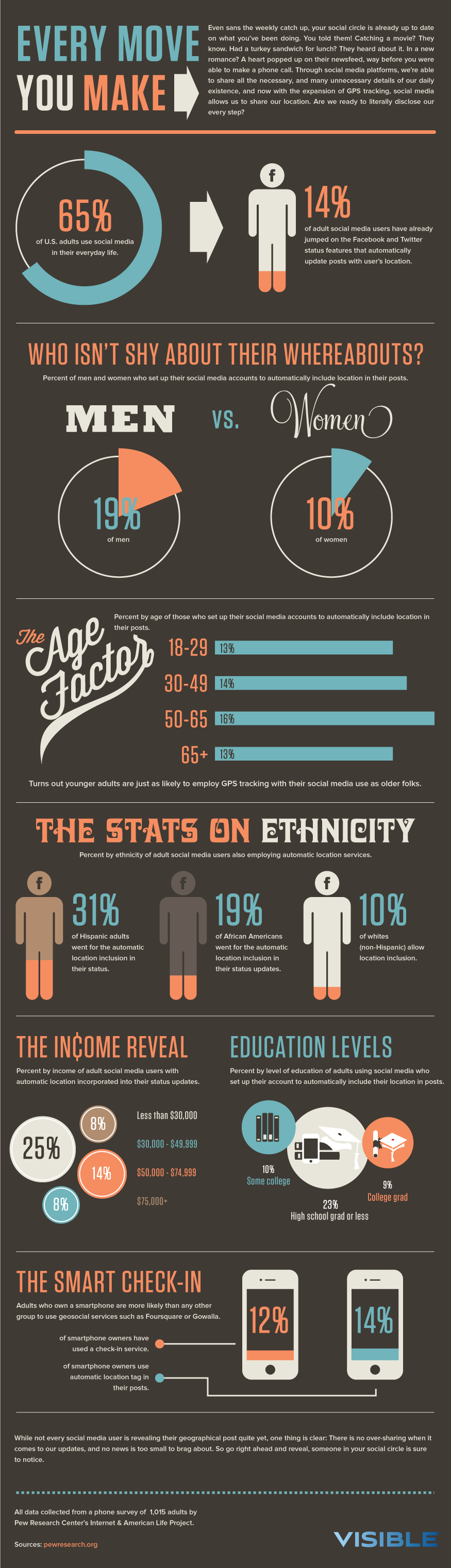
A low level of detail and realism are incorporated into these two designs to provide an association for the viewers to see where the institutions located respectively. The use of leading lines from the location to outside of the US border to indicated where the university located (approximately, with respect of the county and the US). I also use the idea from the "WHO ISN'T SHY ABOUT THEIR WHEREABOUTS?" to help me put my map together. Hence, the black outline around the small filled shapes. Additionally, I used color code to emphasize the attribute like "THE INCOME REVEAL" did.

In the first design (the purple), the purple color was testing out the color to see how it feel and look to me personally. However, similarly, for both design, I used a darker color to encode the location of the university like how it is done in this guide (in the first section). The use of purple/green color for the locations was coming from the part of the poster where the designer(s) used the green map and highlighted yellow. Instead of highlight, I used the light green color for the leading lines to guide viewers attention to the necessary additional information. Then, I kept parts of the design body text color as black, unless it is something I want to draw the viewers attention like the number of men and women awarded the degree in computer and information science, then I use the color teal-ish green and yellow golden-like. While the use of yellow golden-like color for the number of men was the intention, including its size, I wanted to highlight the statistics by making everything look almost like it is part of each other, except the number of men that was awarded a degree in computer and information science.
Critique
Krishann
- For the first design, the first thing noticed was the map outline of the US, then pay attention to the title. Next thing noticed was the label of the universities and locations on the map, which led to an assumption that it probably highlights the statistics of specific universities.
- See the differences between (huge) the number of women and men in all three universities.
- Looking at the keys, assuming it is the number of degrees awarded.
- In the second design, spotted almost the same thing - specific label proportion of the maps, and there is an additional school label. However, it shared some information in the first design.
- The color is green instead of purple-ish that was used in the first one.
Making the assumptions that all of the little green boxes are a school across the countries.
Preference - the second one because there are more information and the keys are larger - make it easier to distinguish the map and associated the color.
VL (visual language) - the use of leader lines shared a similar style to the VL and one difference is, it seems to be thicker on the VL.
- Suggestion: Most of the objected are filled, except the chart. Consider filling color in for the map, instead of having the entire white background, it will follow your model more and play around with the color.
- See the same kind of typography, but the difference is, no title and the title is in display fonts.
- Both designs follow the same style of VL.
Color guide - the second design followed more because of the green color that is used, as well as the orange. In contrast, in the first design, the only thing that follows the color model is the label. Another difference was used for the second design is also darker. Additionally, make sense to have the orange to highlight the key information, like the text percentage.
Response to Krishann Feedback
After reading Krishann feedback closely, I felt like my design definitely conveyed the information I want the viewers to notice - the number of women and men in the universities in relation to the number of degrees awarded. Though I was not intended to express there are only three universities and four universities for the second. When I was working on the design and did not save like every 30 minutes, my laptop crashed halfway through that resulted in the misinformation on these designs. In total, there should be five. Taking Krishann comments into consideration when working on iteration 2, I played around with the color a little bit and fill the background map, and followed the second design in the first iteration and hope the same kind of things the viewers will notice first will be the same.
In terms of a color guide, when Krishann mentioned how I did not follow the color model for my label. I clarified with her, and she referred to the use of my color for the counties that were coded based on the number of degrees awarded to men and women in that area. I used purple because I was exploring how would the map feels if it does not look just green and other colors. Eventually, I came back to keeping my design to the color green because it will fit my the visualization more when put everything together.
Rebecca
- The first thing noticed was the leading lines that brought attention to the universities' information.
- Then looked at the keys, tried to understand the color levels referring and it said completion, but not exactly understand what completion means, and assumed it is referring to those who completed their degree. There is a lot of white space which is why make it confusing. Then, going back to the labels and noticed, "degrees awarded", "men", "women". Another thing that was noticed from the design is the uneven distribution between men and women - drastic: western governors, and as well as CMU but not as big.
- Like: simple and only three highlighted, easy to focus on. It looks clean, and the color encoding. It does make "men" a little more standout because of the orange text, while women color is associated with the leading lines, which make it seems like it is a part of the design.
- Second, similar to the first one except all the map labels are green.
- Another thing noticed from this design was the information about colorado technical university added and shown as similar gaps between men and women in the university.
- The use of leading line (the circle) - it is orange, which is different from the first one. Also seeing a lot more green in CA, assuming there is more tech in the area.
Curious: why the certain area has more than others and spread out.
Preference: the first one is more aesthetic because the contrast with the label and the second one is leading lines - the use of yellow and green. The green is similar to the label, which cannot see the contrast.
VL (visual language: get rid the outlines inside the maps to make it closer to the visual language. The fonts, thin/skinny - use for number, which is consistent with the models and topic header; change the font for the keys as well, header for sections used fancy fonts - could be used for the school names. Noticed that the leading lines use was coming from "THE SMART CHECKIN" section - the different use of color in line and circle.
Color guide: there is a white background with a texture on it. There are two maps, and they colored differently - green for the map color and yellow for the highlight, while the other one has yellow for map and green for the highlight. Consider changing the color to the teal green color like the color guide. The guide used black for body texts. Everything seems consistent. Overall, the model used a lot of teal green color, maybe see how you can incorporate into the design.
Response to Rebecca Comments
Through Rebecca's perspective, I can tell that she was able to pick up the same information as Krishann did. However, I noticed, even during the critique session, Rebecca was struggled to understand what the graphic said at first, similar to how she said it. With this consideration in mind and to ensure I followed my visual language model as it goes for the simple style, I removed the key (Completion - the color scale) and focus solely on the five universities, and how can I improve my design. Though I like the fact she noticed the subtle implication I made with the use of color for a number of women and the leading lines through the use of color association. Her comment on the leading lines lead me to play around with the use of color black and light green, I think the black does well for the map due to the background colors. However, I want to see how individuals respond to the use of colors for the leading lines. So, I played with different colors of organization in iteration 2. Though all of them might look no different.
Furthermore, I removed the outlines of the small parts (the states) of the map to ensure my design align more with my visual language as Rebecca brought up and the idea of getting rid of the outlines. I also changed the background of the map to teal-ish green to align more with my color guide, including a blend between yellow golden like and white for some design.
Answering her curiosity, because of the data I had talked about counties and number of computer and information science degrees that counties awarded to men and women, it did not make sense when aggregated everything together on the state level as it did not speak the purpose I wanted to speak. Especially, after playing with the data and aggregated differently on Excel and Tableau.
Hedy
- First, trying to look for the title and did not see the titles. See there are three universities and assuming you are trying to show the comparison of men and women in these universities.
- Wonder: why there are only three universities.
- After looking at the keys, assuming that each of these threes has awarded most degree based on genders.
- A lot part of the US that did not specifically label because (assuming) they did not award/completed the degree.
- Second, the first thing noticed there are four universities and used green.
- Pointed to the high complete one and the use of leading lines to associated location and university.
The two designs are almost the same.
Preference: the second version shown more regions that awarded degree/completed a degree by the genders and easier to comprehend. Want to see the map separate by states, and (suggestion) having the layout/fill out which states are which, it is easier to associate the school physically.
If it is possible to see some men and women illustrated on this map. For example, put two maps together with the same background in different colors, one is for men and one is for women.
VL: there is no map that is being used but can see as the use of leading lines were emulated from the VL. Overall, can see some resemblance. However, the leading lines on the VL are more 90 degrees, perhaps, change the line angles a little. There is a lot of number display on the visual language model. Maybe make the number big?
Color guide: the green and pink that are used is a little depart from the model. The main color used in the color guide was green and yellow. There is a map in the color model, and it is a great one to emulate from.
Response to Hedy Comments
did not include the title because I could not come up one. However, I added after having a discussion with JoJo on how to ensure my design emulated well from the visual language and color guide, instead of departed from both models. As I mentioned previously, I only included three universities were an accident. Though it seems like Hedy, Rebecca and Krishann were able to pick up the information I am trying to convey, but I did tell her that parts of US that do not have labels because they did not offer a degree in computer and information science. I did not include this information in the second iteration for now because I have not to figure how to incorporate in a way that will not make the design look overwhelmed.
Taking her feedbacks into account, I did test out the display through the use of states and counties and states in my display to allows the user to associate the university located on a higher level. In Iteration 2, I included all three designs with more or fewer adjustments for each as I want to know how others would respond and which one gained more supportive feedback. I also changed the leading lines to all 90 degrees as I noticed provide a sense of geometrically organized and I like that. In contrast to my first iteration, I did not pay attention to that as I paid more attention to saving space. Additionally, I modified the texts and numbers of the display to be bigger. However, I increased the size of the number of men to show the disparity.

Iteration 2


From these three designs, it should convey all the same messages. First, it is talking about the number of men and women that acquired a degree in computer and information science in these top 5 universities that gave the most "degree to women and men. Second, the gender disparity in this major is huge. This should lead them to wonder why and how it happened. When putting together with other displays, it will make sense how this plays a role in gender disparity in the industry like tech.

Since my visual model does not contain a location display visualization and after I had a talk with JoJo and Marilyn, I thought it was cool to work on my location display through utilizing a mixed concept from both my visual model and color guide. Especially, since my color guide used maps. In this case, I will describe how what I did for the second iteration in a manner of joining these two sections together.
Parts of my work that was emulated from the visual language model are the low level of details and realism, the use of fill shapes, leading lines, line weight, the size of the numbers and displaying the location display title, as well as the use of description (/sub-title/ caption) about this display. The use of fill shapes is necessary here because it helps eliminate the unnecessary details that will confuse the viewers when they look at the design, which is what I did for the background map, the states and/ or counties that matter. It also makes my visualization look less as well. The use of leading lines helps guide the viewers' attention of which states and/ or counties associated with which school. In other word, it provided a geographic visualization where the universities locate. The use of description provides an alternative explanation and how long ago was this data to provide a sense of validity about the information. Then, the use of line weight, it looks rather thin when exported as PDF and PNG, but I did not put much weight on the lines as I feel like the viewers will not able to detect the approximate location of the school on the map (which is another reason why I keep the leading line there). Last but not least is the use of the low level of details and realism of the US map, as it will let the viewers know these schools are located in the US, in the case of they are not familiar with the location of the state. Finally, the size of the numbers. I intentionally made the size of the number bigger for men in comparison to women to express how they are already "dominated" in our education system before entering the workforce.
The use of colors for the title coming from both the visual language model and color guide (referring to the title of the color guide and the section of visual language "THE STATS ON ETHNIC"). From here, I borrowed the idea for my title as I thought that was short and on point. I followed the use of green and some gray color for the title, which is similar to the color guide, but there is a different meaning to it. In tech, almost everything is green. For example, the motherboard and the RAM. In general, there is a reference to growth when using the color green. The use of green for "the stats on" has a subtle implication that this is a growing gap in this industry. This is also another reason why I explored the US map with the teal-ish green. Then, the use of gray is referring to something that how it does not get the attention it needs because in general, we, as human always seem to care the binary division of thing as right or wrong, black or white, but it is rare to come across to someone would say something else. At the same time, gray also another implication of the lines between black and white is blurred. This is true in this case because you can find data about women and men in the tech industry, but what is the likelihood of coming across of the data about another gender that is not women or men. The use of yellow golden-like color for the graphic, I just want to test out and play around the color options after looking close in the first and second sections of the color guide. Lastly is the use of color yellow golden-like color for the men was to highlight the "domination" of men in computer and information science, along with the use of putting emphasis on size to express that they are the leading population in this field. The use of green for women as it is more neutral and people are less likely to pay attention toward, including how they are growing but at a small rate (this will make sense when all the displays are put together).
Critique
Anusha
First
-
See two different colors for the title, and gender is in gray, and the US map in the orange, except certain states.
-
All these states are in teal or turquoise and a part of that state is white showing universities, which connected with lines and a note at the end. Then, read the subtitle after.
-
Under each university, there are three details, the number of degrees awarded and men and women.
-
The text size for the number of men is larger – guessing is to show that there are many more men than women to express the gender gaps.
-
-
Was surprised to learn that the university as UT is 71 women
Second – Everything is the same compared to the first, except the color is inverted.
Between the first two, definitely, the map in turquoise instead of the orange because it brings out the orange more. Can use it to highlight.
Third – Most different – like no outlines of the states except the university.
-
Least prefer because would like which state does it located in.
Last – The title is orange instead of teal and the map is teal instead of orange.
-
Everything is the same and the state in the orange.
-
To show the location of the university, there is the location icon, instead of the white label.
Preference – the last one because the white outlines are not important and knowing the overall location like where it locates in the state is necessary. The gray icon related back to the title which provides a sense of unity.
Visual language (VL) & Color Guide:
-
Model emulated well like the location icon within the state and within another map. The color work really well with the last one similar to the model. They also did certain words of the title in different colors; the same thing is noticed from the color guide as well.
-
The title is (seems) similar to the VL/Typography and the subtext is the same as well.
-
All the number in the color model is orange or turquoise, same thing is done for the design.
Response to Anusha Feedback
Overall, I was able to convey the message through the visualization and got Anusha reacted to the information about Western Governors University in Utah. At the same time, I was not surprised that Anusha prefers the last one because I actually do like the teal or turquoise color for the US background and used yellow to highlight where the university located in relation to the US, and the states. I definitely
Renee
First and second a together except the color is inverted. In the first two, see the total degree awarded in general, then to men and women. Assuming the white fill in the graphic is the size of the universities when it is not, it is the county.
Second – “blue” background and yellow highlight.
CMU statistics seem to be okay. In contrast, there is a big difference in Utah.
Definitely, like the background teal/blue color in the second because it looks eye-pleasing and the yellow highlight the blue well, as the white show county.
Third – took out the states entirely and keep the counties, and the teal/blue background map. Highlight counties, but it is not necessary to tell others because people are less likely to be aware of other state counties besides the states, they live in.
Fourth – took out the counties entirely and put a location icon to show the where the universities are (approximately) – this provides the exact location and highlighted which state is part of.
Preference (overall): The last one provides a more accurate location and conveys the message. So, consider making the location icon white to provide a higher sense of contrast.
Visual language (VL) and color guide (CG):
-
The title text match (closes) with “THE STATS ON ETHNICITY”, while it has fancy details, the one that used for the design is clean and bold.
-
The subtitle and use of texts share the same as the VL model.
-
The map is not overly detailing, not as realistic, which match with the VL.
-
The use of two colors in the first section of VL is similar to the use of colors for highlighting the states within the US.
-
(CG) the design used the same teal and the yellow is spot on with the CG.
-
Gray for the text. Yellow and teal for the numbers.
-
The different use of colors in one phrase like the color guide
Response to Renee Comments
When Renee misinterprets the information of the white color graphic, I already knew that the counties marks are too much for certain people and could affect the way they understand everything. This was one of the many reasons I decided to went with the third iteration (the one without counties) for my final iteration. Though, I think my work still conveyed the message because she notices the difference between genders and the big difference based on locations. Overall, my work seems to expressed well how it emulated from the visual language and color guide according to Renee.
Khoi
For all four, see the US map with some states are highlighted, then notice the title and the description after. Then, notice the leading lines that lead to the texts with the university, degrees awarded, men and women. The difference is the men number is in yellow and women is teal which aligns with the color of the maps based on the version. Except for the third one, there is no highlight.
In terms of preference, all three that highlight states are easy to look. While the other one is simple (no states highlight) and would convey all messages – instead of using white, use yellow because it does a better job highlight, as it would also increase the contrast.
Overall the leading lines are helpful and use the number in a different color for men and women and total degrees awarded to highlight the information.
VL and Color guide:
-
The map is consistent with how VL is doing for the graphic
-
Leading lines are consistent.
-
Typography seems to be consistent for the title and the title emulated well from the “THE STATS ON ETHNIC”. Instead, here the “THE STATS ON” are different color with gender.
-
The use of color is great as it does a good job highlighting and minimal the use of white.
If do decide to go with the one that highlighted the states and counties, would prefer the second one (the one with teal background) because it provides more details. So play around with the color more.
Response to Khoi Comments
At first, I was surprised to learn Khoi preference even when he explained to me during the session. However, after I dissect our conversation with JoJo, I can see why he said what he said and I definitely agree with him on his decision on the third info graphics. Additionally, the way things are organized and use of colors are not too distractive. With this consideration, I took in his suggestion and went with the third design (with no states marked) for the final iteration and take advantage of the yellow-golden like color.
Final Revision

Originally, I kept at the position of the counties and states marked on the amp as I think that provides clear information about where the universities located. However, after listening to Khoi comments and talked to JoJo, I realized, having states and counties on the map are redundant, when I already included the state and city of that university. Additionally, I removed counties because one of the persons gave me feedback that having counties there may be unnecessary or something along the line of how we, the general public, don't pay attention to states counties unless we living in. More often, people only care about the city name, then the state. I thought this is quite true, even for myself. So, the decision of removing the marks of all counties are removed. Lastly, its the decisions of which school included on the map. At first, I only had five universities that were ranked at the top 5 institutions that gave out the most degree/certificate in the IT (IT: Information technology - because I still cannot figure the way they aggregate the data is still unknown for me, but I definitely know the information was not only from Information Technology field after did some exploring with the fast link to access the data, with this also keep in mind, all the data on here are aggregated from the IPED (NCES - https://nces.ed.gov/ipeds/use-the-data)). The purpose of using multiple schools from all over the US is to compare if the number of women studied this major/field is only low in a certain area. Overall, after the viewers looked at the works, they should able to complete the sentence (something along the line of) "I learned the number of women completed their study in IT remain low, except some institutions and .that seem to depend on what happened at that location."

Since my final iteration was more of picking the design that works well and add more information, the description of how my work emulated from visual language and color guide is almost similar at Iteration 2. Again, I will describe how what I did for the second iteration in a manner of joining these two sections together.
Parts of my work that was emulated from the visual language model are the low level of details and realism, the use of fill shapes, leading lines, line weight, the size of the numbers and displaying the location display title, as well as the use of description (/sub-title/ caption) about this display. The use of fill shapes is necessary here because it helps eliminate the unnecessary details that will confuse the viewers when they look at the design, which is what I did for the background map. It also makes my visualization look less overwhelmed as well. The use of leading lines with a somewhat thin line style to help guide the viewers' attention to the approximate location of the school on the US map. In another word, it provided a geographic visualization where the universities locate. The use of description provides an alternative explanation and how long ago was this data to provide a sense of validity about the information. Last but not least is the use of the low level of details and realism of the US map and the location icon, as it will let the viewers know these schools are located in the US, in the case of they are not familiar with the location of the state. The purpose of location (as I had mentioned many times) is intended to provide a physical sense where the institutions would locate if we are looking at these institutions on a realistic level. Finally, the size of the numbers. I intentionally made the size of the number bigger for women in comparison to men to put an emphasis on the number of women that completed their degree/certificate are already low before entering the workforce.
The use of colors for the title coming from both the visual language model and color guide (referring to the title of the color guide and the section of visual language "THE STATS ON ETHNIC"). From here, I borrowed the idea for my title as I thought that was short and on point. I followed the use of green and some gray color for the title, which is similar to the color guide, but there is a different meaning to it. In tech, almost everything is green. For example, the motherboard and the RAM. In general, there is a reference to growth when using the color green. The use of yellow-golden like color for "the stats on" was to highlight the graphic because if the teal-ish green color, chances the viewers miss out the title and have to come back the second time is higher. I continued to keep the US map with the teal-ish green color because of its a growing country, especially with the diversity. Additionally, the use of yellow-golden like color for the location icon because with the dark gray, it almost seems like the icons are blended in with the map background color because of the hue level of these colors are almost similar, unless I changed the transparency level of the US map. However, after playing around with the color options from the color guide, yellow-golden-like color does work best.
Lastly is the use of color yellow golden-like color for the women their fall behind in relations with this occupation and information science, and the drawn people attention to those numbers. After the first two iterations, even though people get the message from my design, I personally think if I used reverse color, people are more likely to look at the number of women first, then men - the use of teal green is an intentional way to blend the numbers in with map, as it also a neutral and people are less likely to pay attention toward,.